Research Critique: Feltron Annual Report

FAR07_02 FAR07_03 FAR07_05 FAR08_02 FAR08_03 FAR08_04 FAR12_02 FAR12_03 FAR12_04

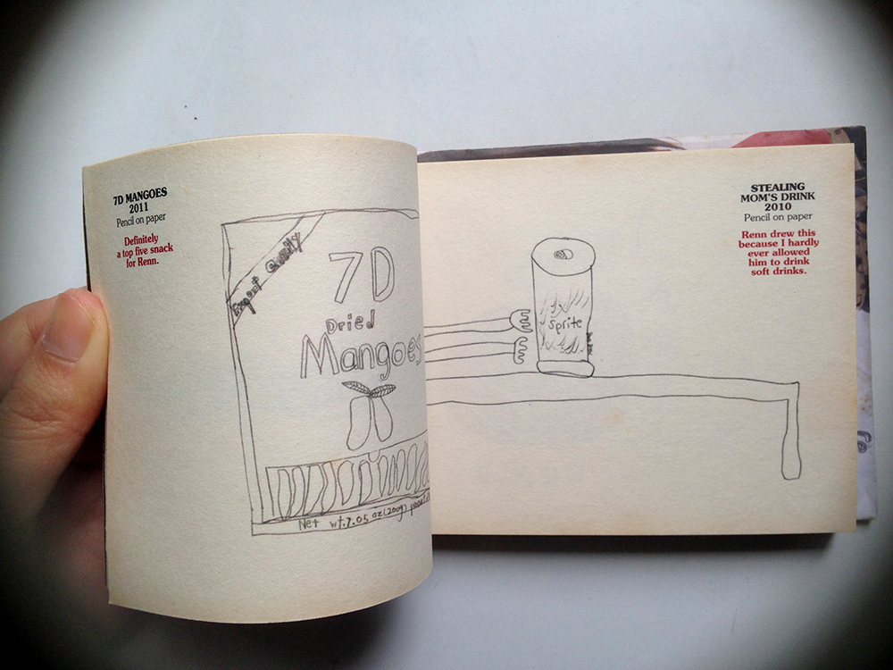
(images from Nicholas Felton’s website)

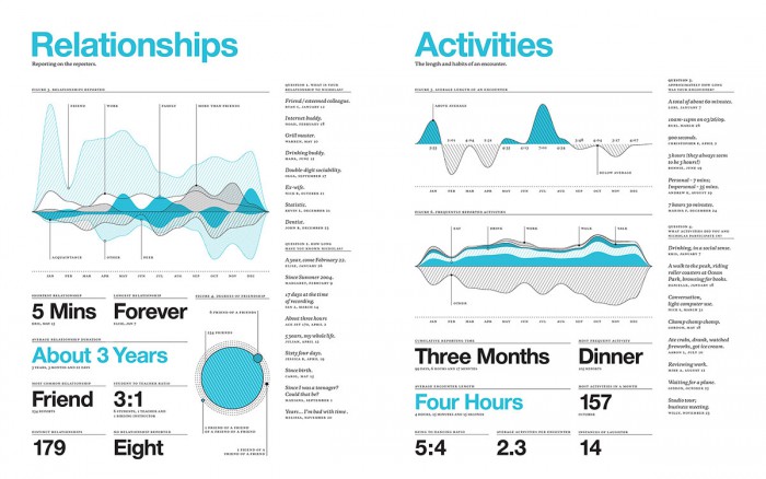
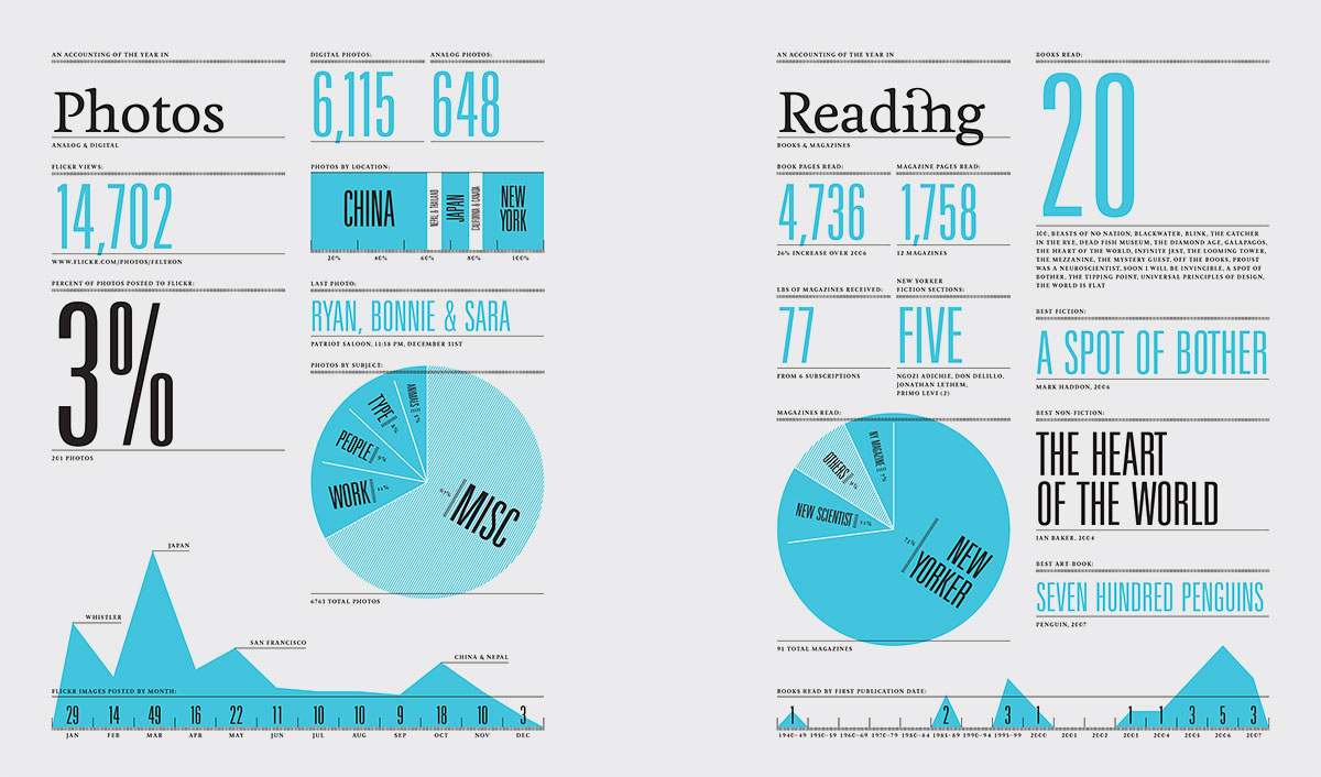
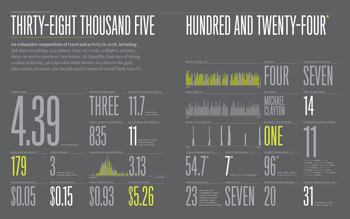
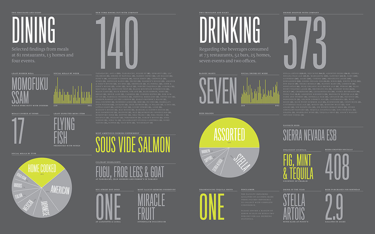
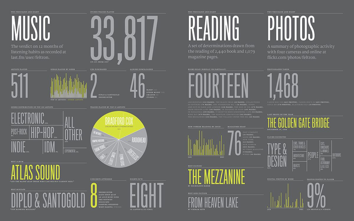
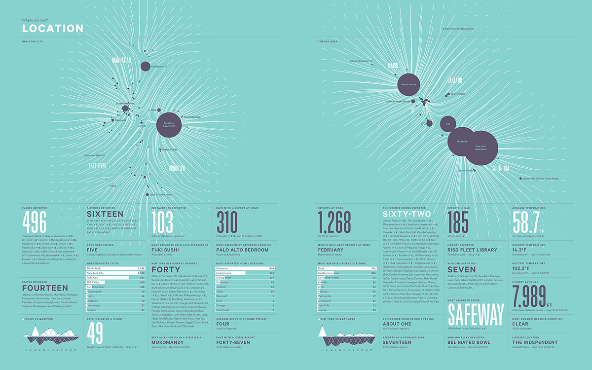
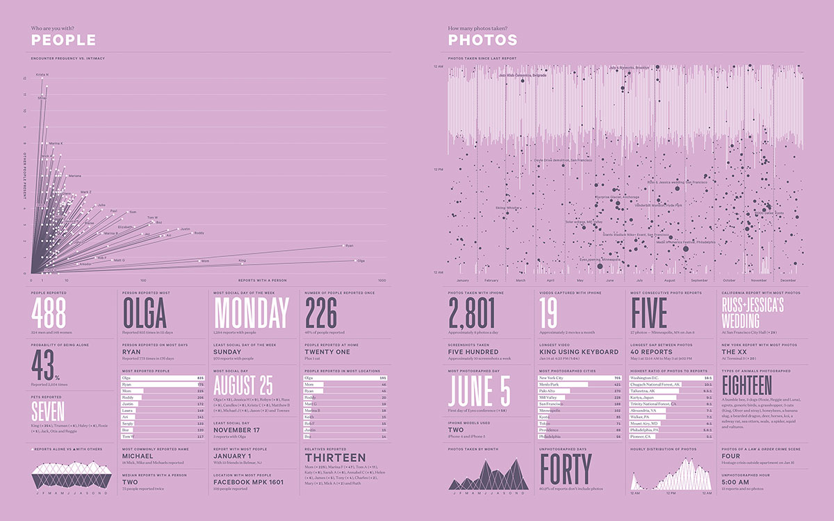
Since 2005, Nicholas Felton have been collecting data on almost every facet of his life and presenting his findings in a series of beautiful graphical posters. Each poster focus on the statistics that makes up a topic. For example, while looking in to his relationships, he breaks down the frequencies he meet people, who he communicates with most often, the amount of time he spends socialising and more. All of these data is presented in a variety of graphs and charts. Through this project, Felton hopes to explore how to graphically encapsulate a year.

Felton is inspired by the concept of annual reports, which are often generated by corporate companies at the end of each business year, as a comprehensive document that charts the company’s activities, earnings and progress. The Feltron Annual Report project is a very refreshing and humorous take on a typically corporate documents. Through my part-time job, I’ve had the opportunity to work on annual reports before, and truth be told, they are not the most interesting project to work on. Looking at Feltron’s Annual Reports really made me think of the annual report in a totally new way.

Felton’s approach to making these personal reports is exactly what I hope to do with my own blog, conceptually. He pairs the impersonal, corporate style of annual reports with personal details of his life, and through the various infographics embedded in each poster, we piece together activities and life in each year. It is a really brilliant example of how data can be used to tell a story.

FAR09_03

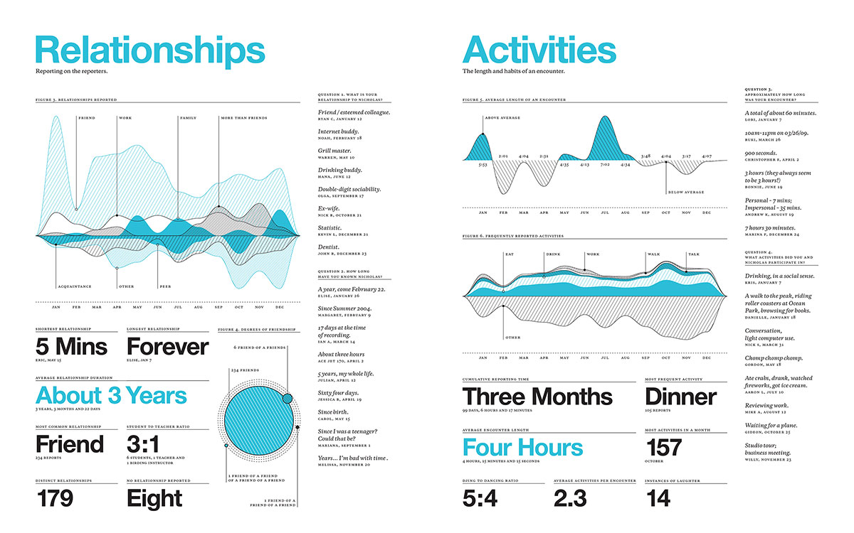
What I also observe in this work is that Felton weaves in his sense of humour in this work, which you can see from the titles he give to each statistic group. “Most Common Relationship? Friend.”

Felton uses a variety of tools to help him log in data: some are apps which are available commercially, and some he built himself. He also acknowledges that while it is possible to collect data on almost everything, what can be done with the data is almost endless.

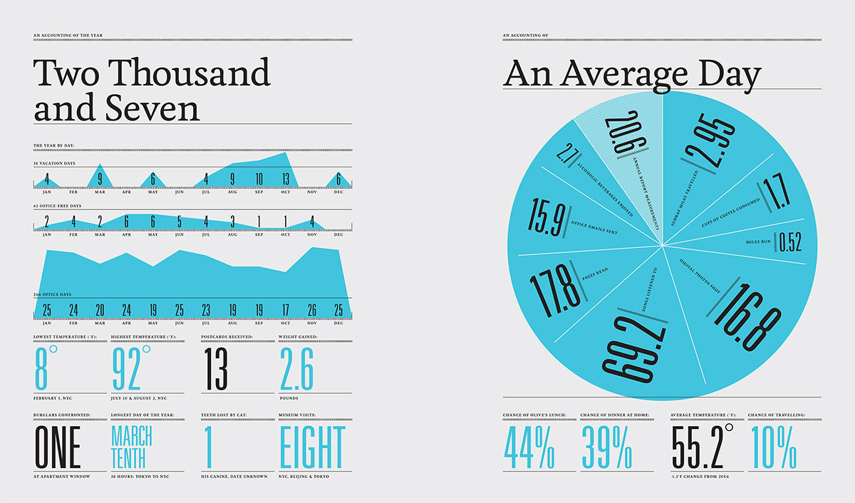
“The data set itself was messy and overwhelming, and filled with enough information for several more reports. There are inherent shortcomings (like the unrepresentative amount of water recorded), and endearing strong suits (like the exploration of mood).”

Felton on report 2009

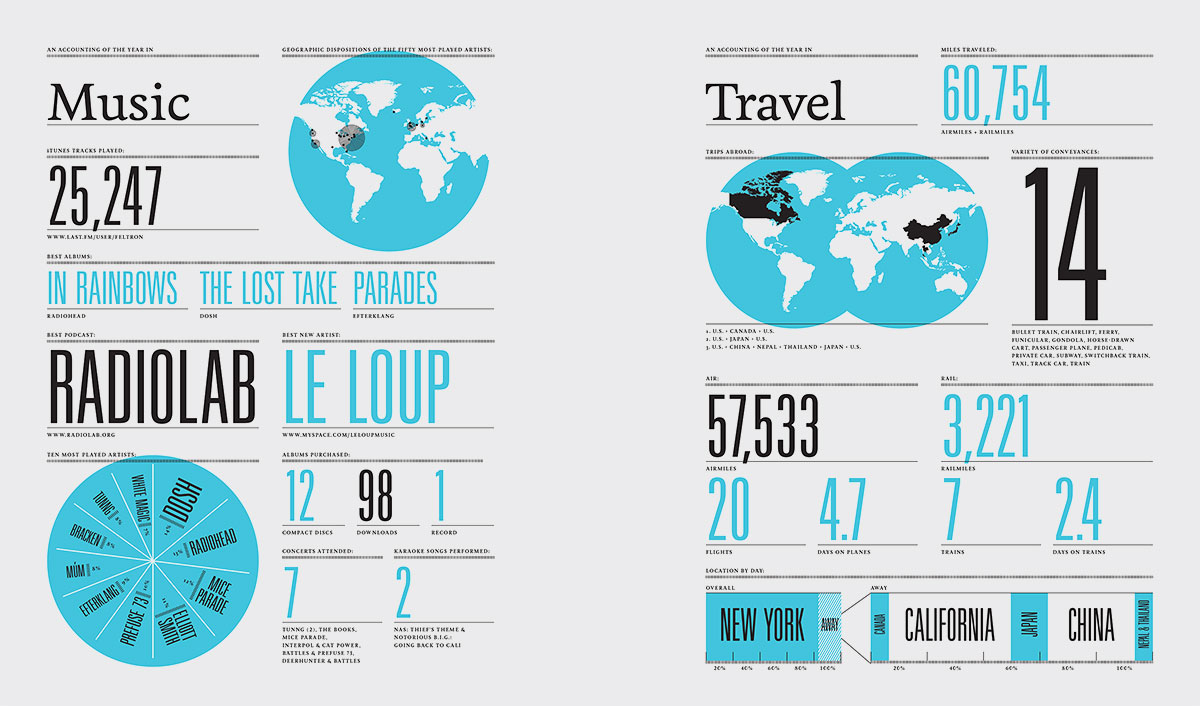
In the span of this ten year project, each report progressed from collecting information about everything to focusing on just one area. For example, in the report 2013, Felton explores his communication data, which breaks down his usage patterns from sources like texting, calling, emailing and being on social media. In the report 2011, he explores how his personality varies in different settings or with someone.

Overall, I find the Feltron Reports a very inspiring way for me to look at how I can work with the data from my blog for each year, by highlighting some of the more interesting details and experiences. I also observe that he each year, his infographics take on a fresh, new style. This also inspires me to use graphic design as a way to sum up my year, and to include (in a subtle way) my graphic influences along the way. I think it can be part of my narrative as a visual artist.


Installation Space = Work Space

The installation space for my work should put the outcome in context. As I am working with my personal archive, I think that the best way to house the works is to build a space that centers around my own identity and practice as an individual/artist. I always tend to think that I am my work, and my work is me. It is not really meant to sound that self-absorbed, but I feel that the process and documentation of my art-making is as important (sometimes more than) as the outcome. I find a personal joy and fulfilment in making the works, and this is what makes me happy.

That sort of gave me an idea for the installation space. The following pictures are from my blog and documented my workspace throughout the years.

Workspace, 2007

colourfulz_by_astrosaurus

workspace2

Workspace, 2009installationspace02


Workspace in the art room, 2010

workspace1


Current workspace

installationspace03

Having a moodboard is important. I built a visual vocabulary out of these amazing Zouk flyers that I collected as a teenager. They have inspired me so much over the years, and I would even go as far as to say that these flyer artworks influenced my direction in life. If I didn’t collect them and take them seriously, maybe I would never be interested to pursue art and do visual communication.

Found a really interesting article from The Design Society Journal, written about the impact of these flyers as an effective visual communication tool for established clubbing spot and as influential, memorable things that are part of the Singapore design scene. I thought it was quite a sweet homage to the flyers and it was nice to finally read about some of the graphic designers behind the works I loved for so long, and also to know that many other local designers share the same love for these flyers that I do.

zouk01 zouk02

In my installation space, I don’t intend to include my collection of Zouk flyers and other print materials. I consider this a part of my archiving and art process, as they make up the bulk of my workspace and inspired me greatly. But I am thinking about how illustrating and writing can come together in my practice. So I might propose that my installation space could include a wall decal, an illustrated piece about my feelings on this.

For the display of my outcomes (print, digital…) I am thinking of using a metal rack.

metalrack_b82220_metal_strong_display_strong_style_color_b82220_rack_strong_wire_mesh_display_stand_r


Something very generic. Depending on the outcome of my wall decal, I might change the material of the shelving to match the decal. For me, the metal rack is a symbol of the workspace. I think having a table or some pedestal is way too literal of the workspace, and honestly a bit too formal. At the same time, it is not my intention to recreate my teenage workspace or something. The FYP is important to me because it’s my last project that I will make as an art student in an institution, and I would like my outcome to reflect this idea of documentation/journey/destination, growth as a individual, and overall, a sense of maturity, I hope. Hahaha. I understand that my work do contain some teenage angst and that kind of stuff, but I want it to be kind of humorous, reflective, but I also don’t want to give the impression that this is who I will always be.

I had a conversation with my friend and we briefly made some plans about having a studio together in the future. As he is a photographer, we both agree that working with someone of a different discipline could be beneficial to our own practices. We spoke of building a library together and having a bookshelf in the middle of the studio as a representation of this collaborative way of working. Likewise, the bookshelf is a repository of resources. I think it ties in with this whole idea of archiving and documentation as well. The bookshelf also represents this idea of transition: who or what I am going to be next, and where do I see myself later on.

Research: B Is For Bauhaus

Just read a book ‘B Is For Bauhaus’ by Deyan Sudjic. It’s a book about understanding contemporary culture and design.

Here’s some interesting things I found in the book that will be relevant to my report.

On our relationships with our possessions,

The collecting impulse is universal, and it goes on to the roots of what is it to be human. It pre-dates mass production and design, but it reveals the essential nature of our relationship with our possessions, how they communicate with us, and the various ways in which we value them. understanding the nature of collecting tells us something about ourselves as well as the nature of things.

To collect any object, we have traded in the original meaning and are looking for something else from them.

The journal is a repository of memories and events. These are also considered possessions. When I look at my archive again, I find myself looking for something else from the words and drawings that I’ve made over the years. Many times I draw the comparison between the person I am then, and now. These are markings that indicate my growth as a person and a creative.

We collect possessions to comfort ourselves, from addiction and to measure out the passing of our lives. We collect because we are drawn to the subtler pleasure of nostalgia for the recent past, and the memory of far-distant history. We collect sometimes to signal our distress and console ourselves in our inability to deal with the world. These are the motivations that designers need to understand, and the qualities which they manipulate when they create objects, whatever their nominal function.

I’m particular drawn to the point he made about distress and consoling ourselves. This year I hardly made any drawings. My journals are filled instead with writing that I made in order to try to understand my own FYP concept better. I also find myself grappling with the struggle of being with a young adult. Time and finance are the resources that have to keep competing with each other, and it makes me feel frustrated. I find that I must divide my time and attention each week to work commitments, FYP, and spending time with friends and family. I look at my older journals and I find that I lost the luxury to make the drawings and writings that I used to. I rarely have the time to feel bored anymore, each moment is dedicated to keeping up with my to-do list. I guess it’s one of the reasons why I needed to deactivate myself from social media. In becoming a young adult, some of these juvenile struggles have definitely (and thankfully) faded away, but along with that, I also lose the need to make artwork about these things. But that’s not to say that I need to be some kind of angsty youth to fuel my creative process. Looking at my journal archive also makes me realise that I sometimes need to not give a damn, and occasionally make some impulsive artwork that makes no sense. To think like a child again.

Collecting is in one sense about remembering, but the digital world never lets us forget anything. Paradoxically, it has also undermined our ability to remember. Our email and text trails will last as long as the server farms that have already conferred a kind of immortality on anybody with a Twitter account.”

This point is definitely relevant to the virtual part of my work. My project is split between my virtual and physical archives. It documents the relationships made online and off.

We remember where we started from online, because the date is recorded when we first made friends on the virtual realm. Green buttons tell me that I know you from a measurable distance. Conversations are trivialized with the advent of animated and very expressive egg man oyster cat girl stickers. Grids of photos let me glimpse into your life and I could say yeah I guess I know you. How many backspaces will it take to bring me back to when there were no green buttons? When your status is set to Away on MSN? Remember the time I told you I was playing The Sims and you told me how you got rid of your Sims? And then you said you were going to build some furniture for your room over the break. And then the conversation ended and the next time I went online there were no traces of the conversation happening. Despite being given a chance to keep an archive of the chat, nobody really goes to the effort to do so. And now we can go back as far as we wish to and point out the beginning of everything. Everything is laid out and easily accessible, pictures and words and the little green circle next to your name. Archiving comes easier for all of us, collecting data is as easy as typing hello to you. The question is how much of this is worth remembering and archiving. You may not remember, but the Internet remembers for you.

Holycrap: Renn Lim by Renn Lim


“Renn Lim by Renn Lim” is yet another one of Holycrap’s creative ventures. I really like how this little book is put together, it reminds me so much of my own journals and how I save little scraps of paper and other ephemera that I love a lot.

What I love about Holycrap’s design approach is that they have a very distinctive and original style. They work with what their large archive of material and make an aesthetic out of it. It is absolutely okay to be messy, or when things get stained. From the viewpoint of a book lover and a creative, I think that sometimes it is important to embrace some of the imperfections and make it a part of design. This book is an example of how elements of art, craft, and design can come together and complement each other perfectly, and make the experience of going through the book so pleasant. Books are meant to come in contact with our touch, dog-eared pages and stains are inevitable. Books should feel at home in our hands.


Photo 16-8-15 11 44 44 am

Photo 16-8-15 11 44 48 am Photo 16-8-15 11 45 03 am


Paper bits that are scanned, printed, and deliberately crumpled by hand.Photo 16-8-15 11 45 09 am Photo 16-8-15 11 45 19 am Photo 16-8-15 11 45 24 am Photo 16-8-15 11 45 30 am Photo 16-8-15 11 46 37 am

Super adorable and amazing replica of the envelopes from photo shops. I laid an actual one next to it for comparison. It even folds up like the real thing. Inside the envelopes are small prints of Renn’s paintings.Photo 16-8-15 11 46 44 am Photo 16-8-15 11 46 55 am Photo 16-8-15 11 47 15 am Photo 16-8-15 11 47 21 am Photo 16-8-15 11 47 53 am Photo 16-8-15 11 47 54 am Photo 16-8-15 11 47 56 am

Holycrap: Till Death Do Us Part


Really enjoyed looking at the second famzine by Holycrap. This issue is particularly inspiring for me in terms of the way the contents are being presented. I have been busy scanning some of my journals and other little things. Looking at this work gives me many ideas on how I can present my data in a manner that is true to the medium. Most importantly, how can I capture the ephemeral quality of these things?

Holycrap had a sharing session at Deck two weeks ago and they talked about how the made the second zine. The second famzine is a tribute to the grandparents of Renn and Aira, a celebration of the older Lims’ 50th wedding anniversary. The cover design is an old Chinese National Language School folder, which was scanned and redesigned to fit the mini-books.Photo 16-8-15 11 39 52 am Photo 16-8-15 11 40 01 am Photo 16-8-15 11 40 07 am

Absolutely charming details being put into this work. Each copy of the zine is individually hand-stamped with the title of the work. And then the folder is intentionally “wrecked” and taped over to give the worn look. If you look closely, the yellow stains are actually scans from the actual folder. It is all very realistic. I’m interesting in going for this design approach with regards to my work because I think the data cannot be simply arranged on InDesign, printed, and that’s it.Photo 16-8-15 11 40 19 am Photo 16-8-15 11 40 24 am

Inside the folder is a 5-part book series with different chapters for their findings. What a brilliant and unique way of designing.Photo 16-8-15 11 40 32 am Photo 16-8-15 11 40 39 am Photo 16-8-15 11 40 45 am Photo 16-8-15 11 40 51 am Photo 16-8-15 11 40 53 am

Photo 16-8-15 11 40 57 am Photo 16-8-15 11 41 03 am Photo 16-8-15 11 41 08 am Photo 16-8-15 11 41 11 am Photo 16-8-15 11 41 13 am Photo 16-8-15 11 41 20 am Photo 16-8-15 11 41 23 am Photo 16-8-15 11 41 28 am Photo 16-8-15 11 41 34 am Photo 16-8-15 11 41 42 am Photo 16-8-15 11 41 46 am


Mini (super realistic) replicas of ephemera makes for a very engaging and intimate experience when going through this work.Photo 16-8-15 11 42 05 am Photo 16-8-15 11 42 10 am Photo 16-8-15 11 42 17 am Photo 16-8-15 11 42 23 am Photo 16-8-15 11 42 28 am Photo 16-8-15 11 42 36 am Photo 16-8-15 11 42 41 am Photo 16-8-15 11 42 50 am

Holycrap: Google Translating Tokyoto


A good friend gave me the brilliant Rubbish Famzines by Holycrap. I’ve been looking through this over the last few weeks. These are some really inspirational work in terms of design and documentation which I will be looking at quite plenty for reference in the course of my FYP.

Holycrap is a local art collective made up of Pann Lim, Claire Lim, and their two children Renn and Aira. They have been making the Rubbish Famzines for two years now and recently launched their fourth famzine entitled “The Incomplete Herbarium and Other Garden City Exploits”.

A few weeks ago, I had a chance to listen to the family share about their project and how they work together to make these brilliant famzines. The family defines the famzines as a family magazine, a compilation of all that they find interesting and memorable to them as a family.

Photo 16-8-15 1 20 29 pm

Holycrap at DECK two weeks ago.Photo 16-8-15 11 43 22 am

Google Translating Tokyoto is the first famzine that they made in 2013. It is a brilliantly pink book documenting their first trip together as a family. Some pages from the zine.Photo 16-8-15 11 43 19 am  Photo 16-8-15 11 43 30 am

Incorporating screenshots, film photos and text.Photo 16-8-15 11 43 47 am

Never thought of it, but QR codes are actually a brilliant way of incorporating virtual content with print. During the talk, the family demonstrated the use of these QR codes, which leads to funny YouTube videos and Vimeo clips. Photo 16-8-15 11 43 55 am Photo 16-8-15 11 44 07 am Photo 16-8-15 11 44 13 am Photo 16-8-15 11 44 33 am

from austin kleon’s “show your work”


“the problem with hoarding is you end up living off your reserves. eventually you will become stale. if you give away everything you have, you are left with nothing – to replenish, to give away, the more you give away, the more comes back to you”.
– paul arden

dumpster diving/
treasure in trash/
culture debris/

we all love things that other people think are garbage. you have to have the courage to keep loving your garbage. because that makes us unique is the diversity and breadth of our influences.