Research: B Is For Bauhaus

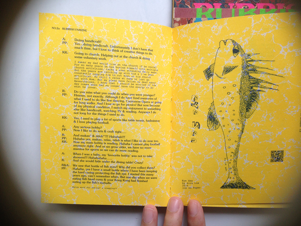
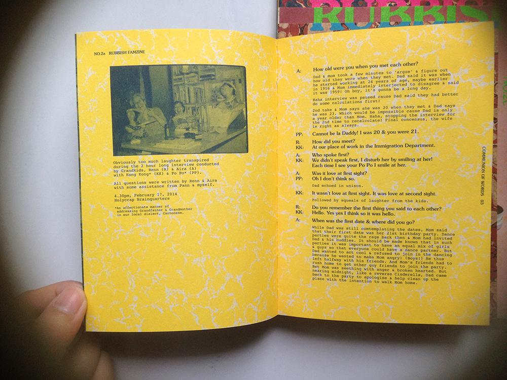
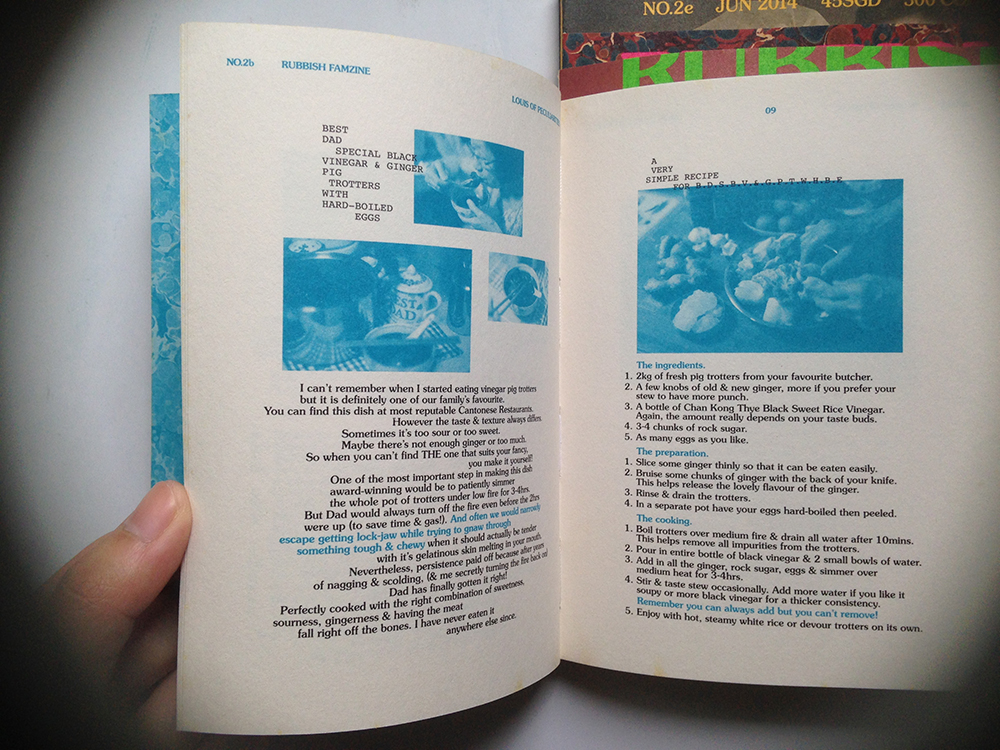
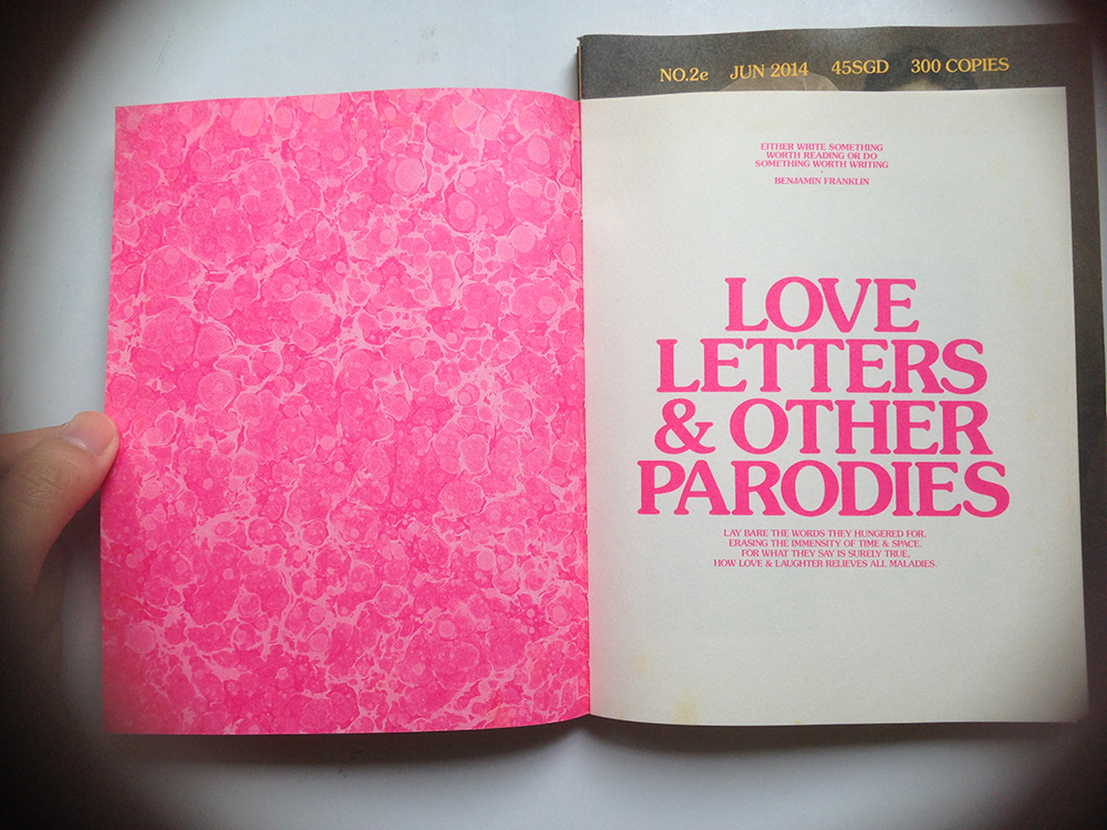
Just read a book ‘B Is For Bauhaus’ by Deyan Sudjic. It’s a book about understanding contemporary culture and design.

Here’s some interesting things I found in the book that will be relevant to my report.

On our relationships with our possessions,

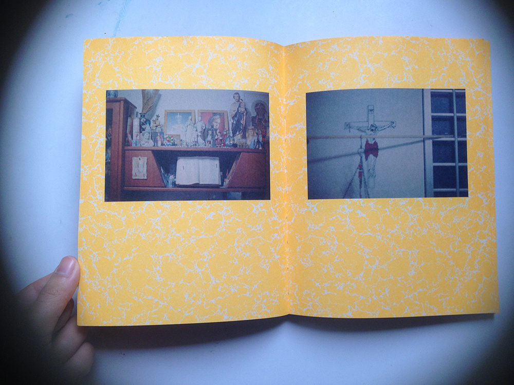
The collecting impulse is universal, and it goes on to the roots of what is it to be human. It pre-dates mass production and design, but it reveals the essential nature of our relationship with our possessions, how they communicate with us, and the various ways in which we value them. understanding the nature of collecting tells us something about ourselves as well as the nature of things.

To collect any object, we have traded in the original meaning and are looking for something else from them.

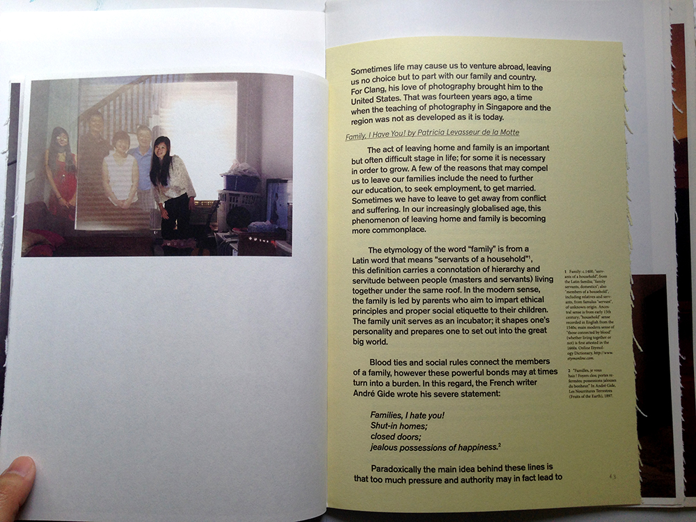
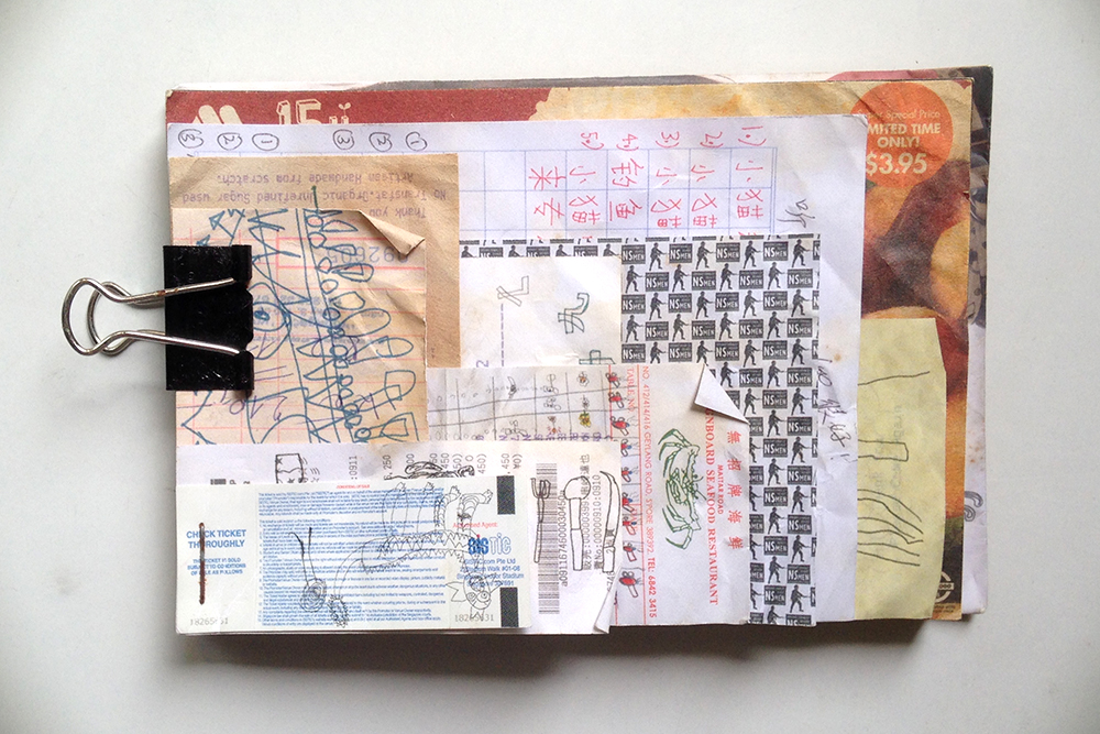
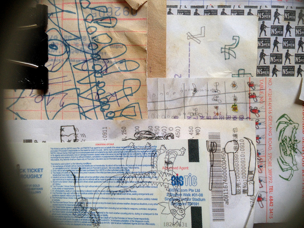
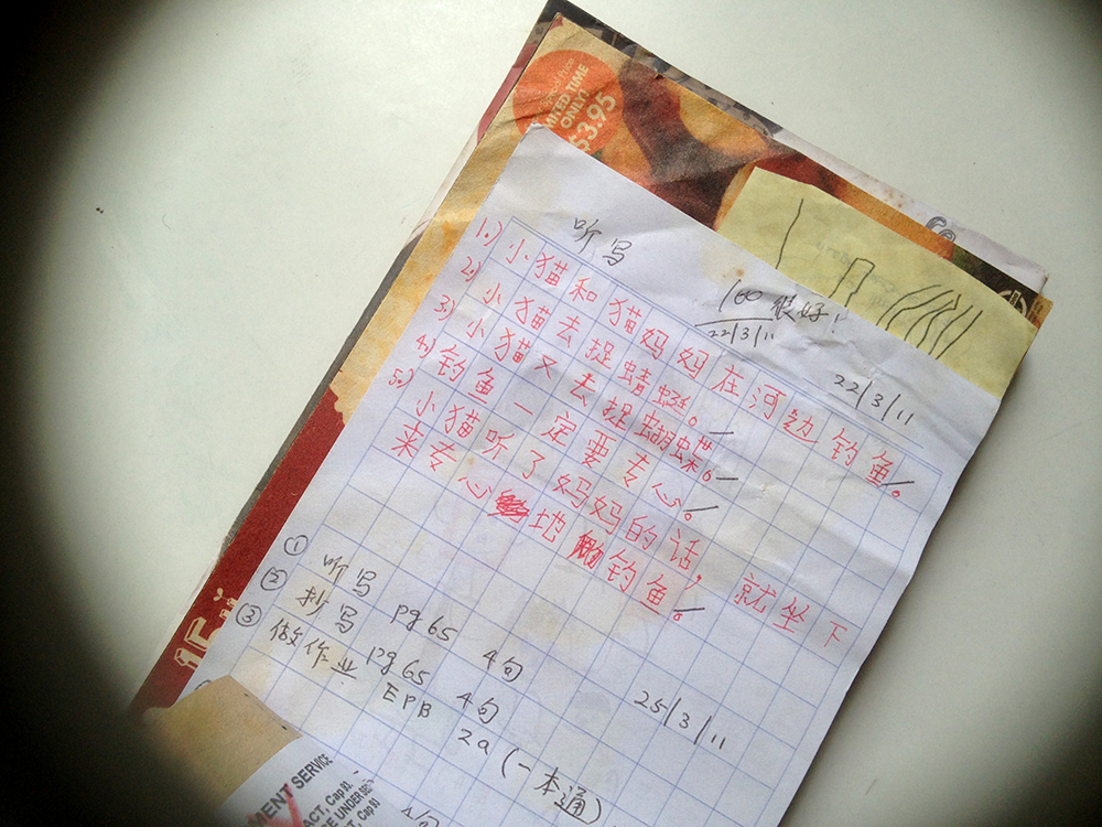
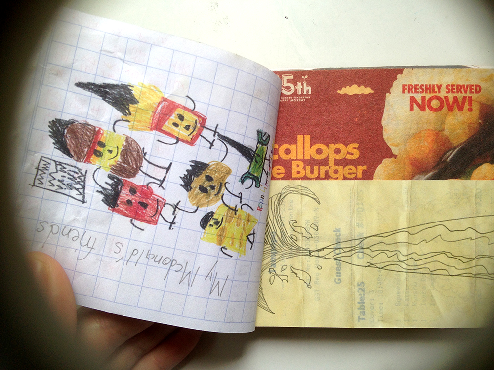
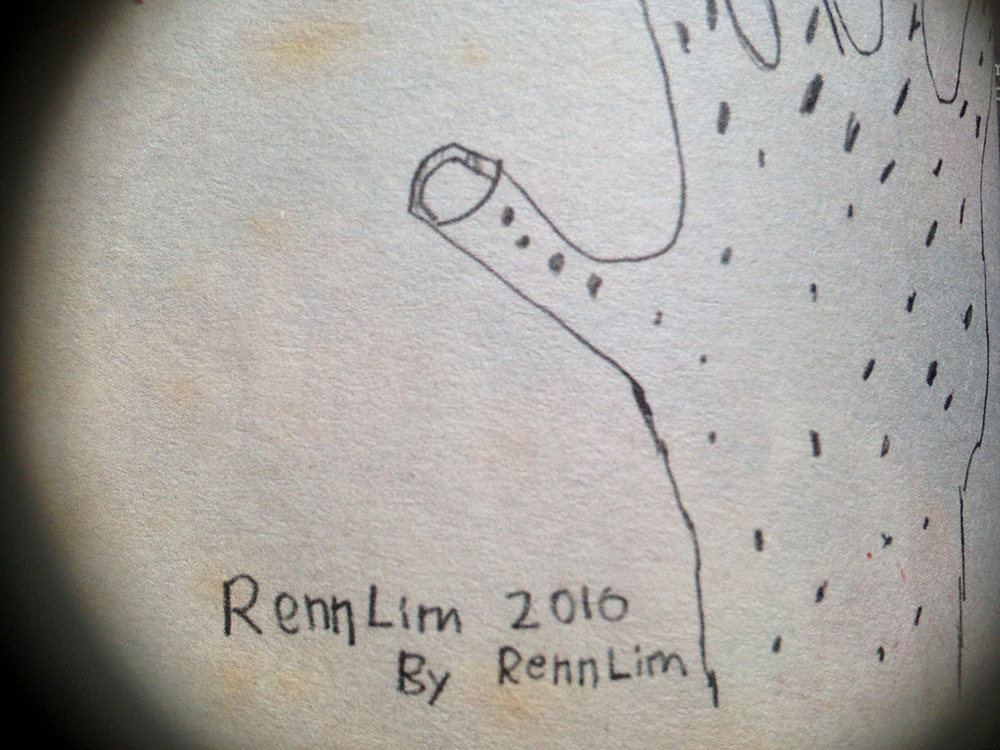
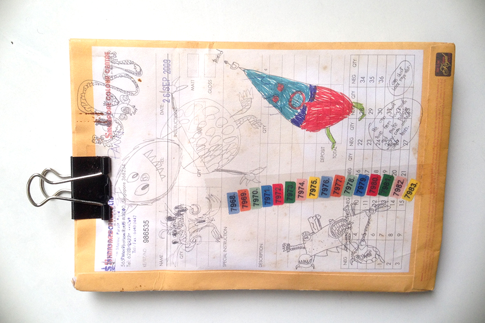
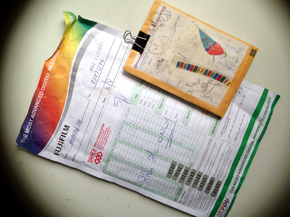
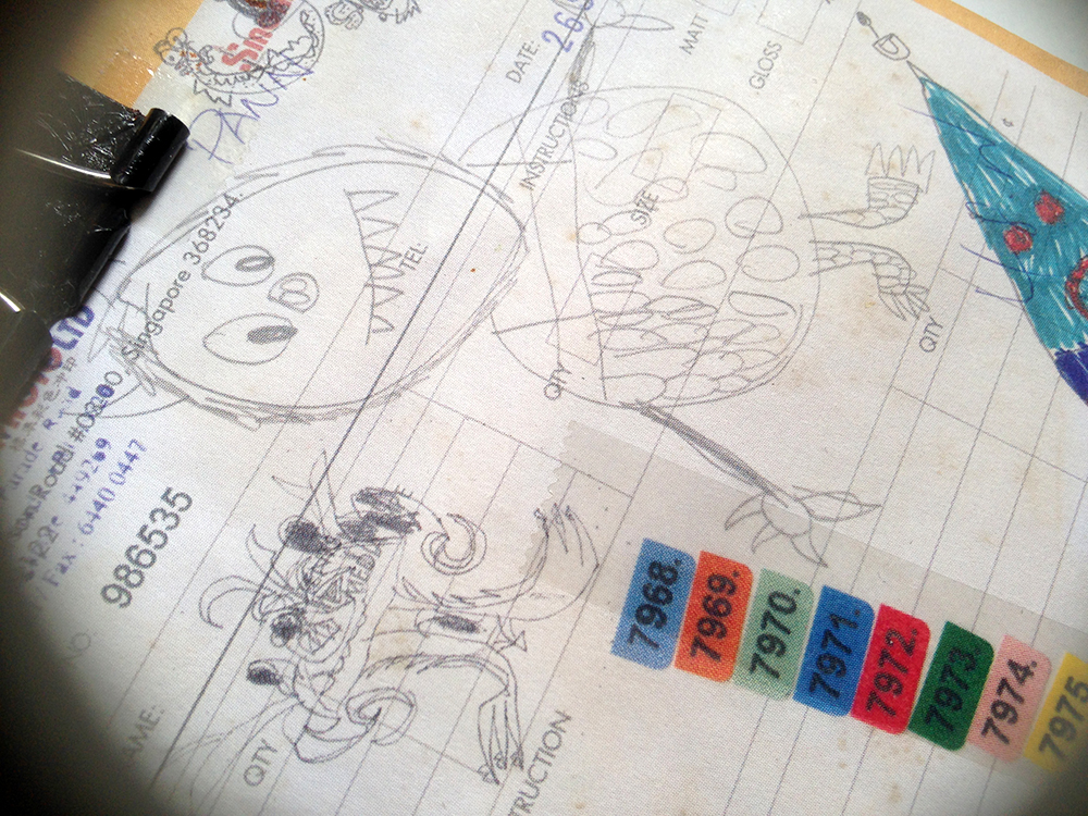
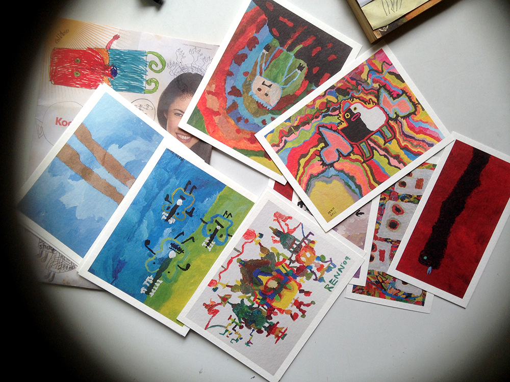
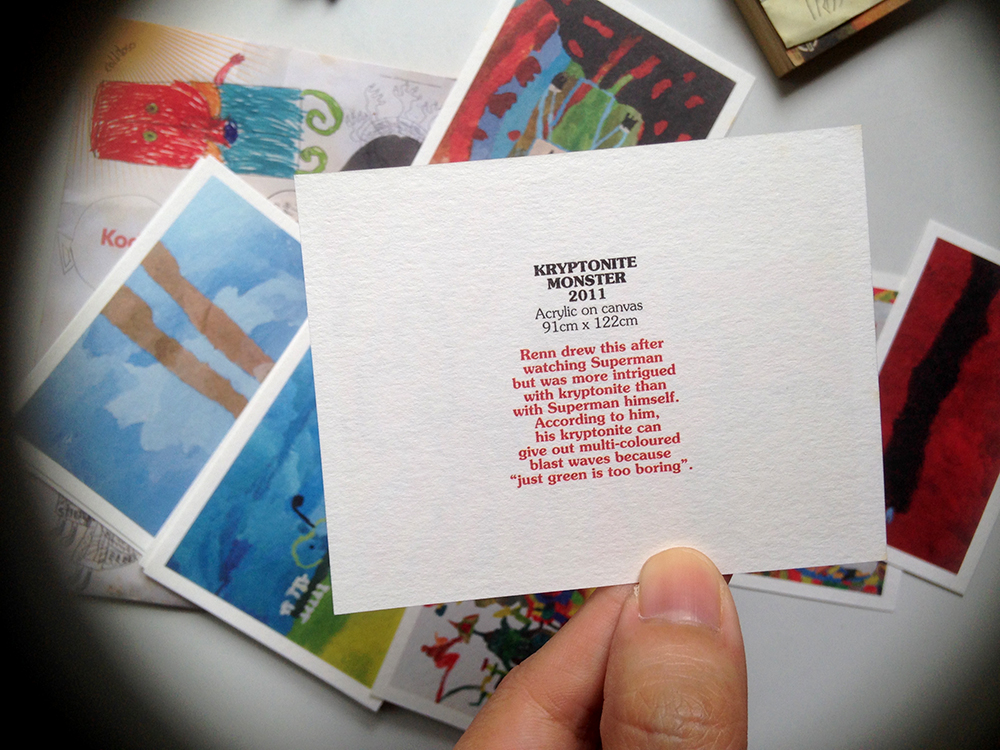
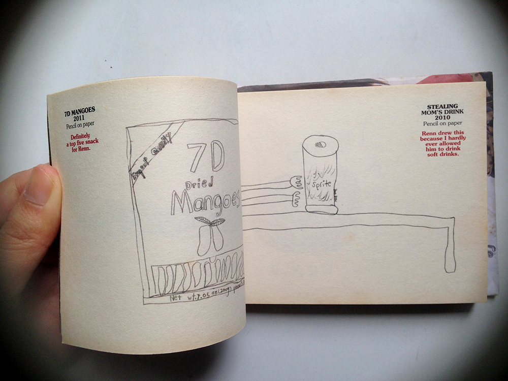
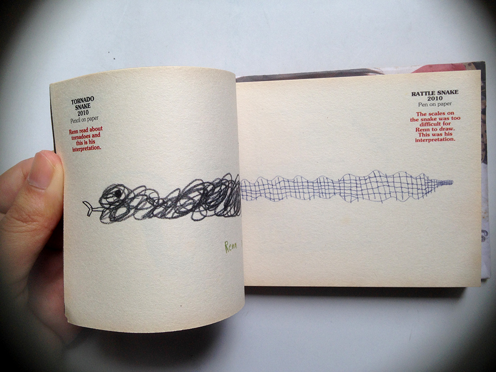
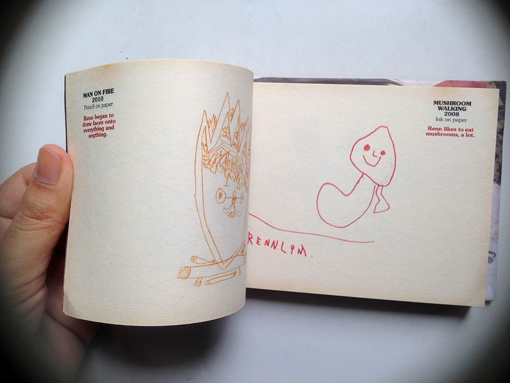
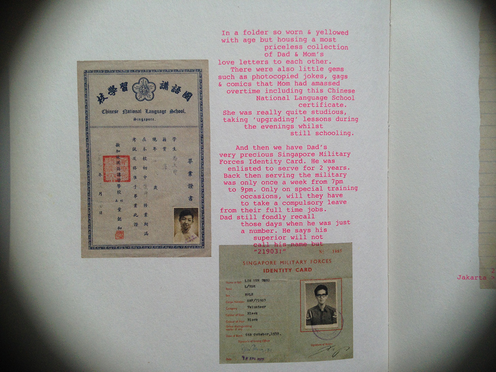
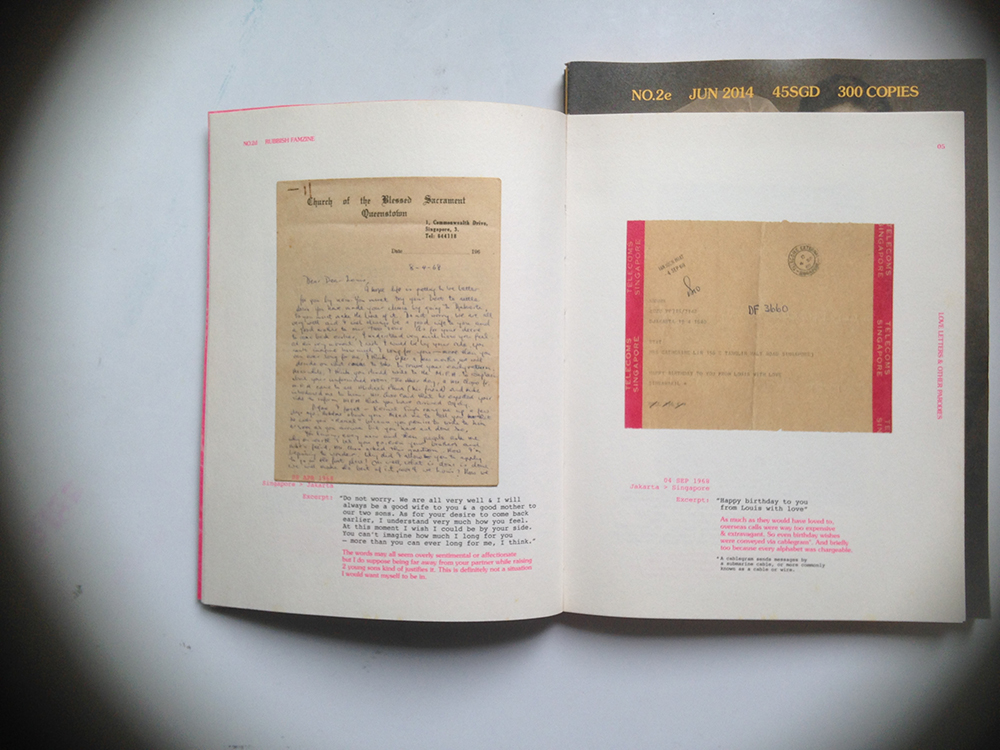
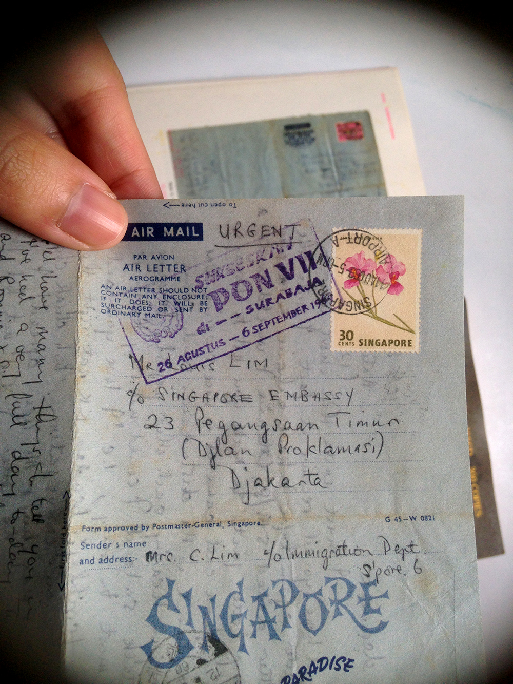
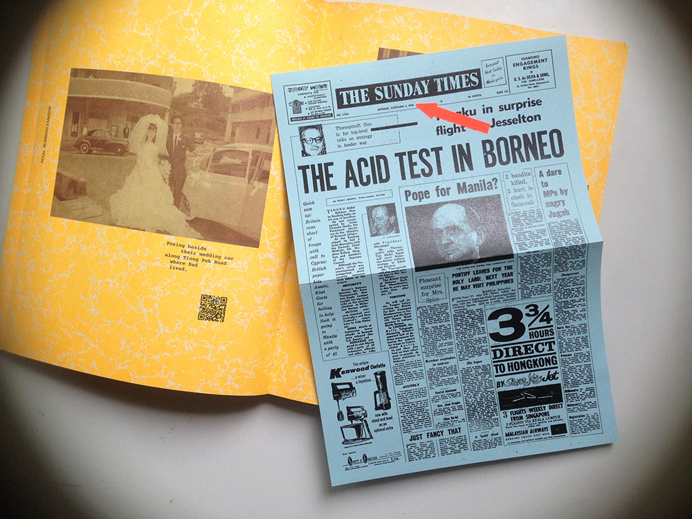
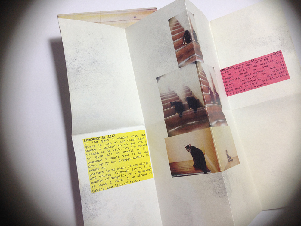
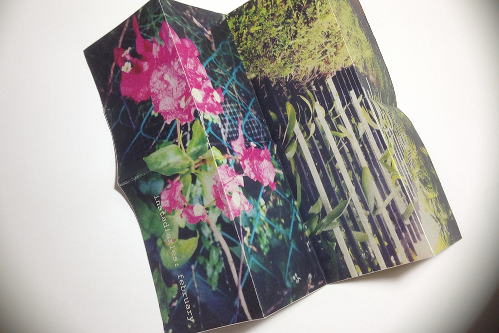
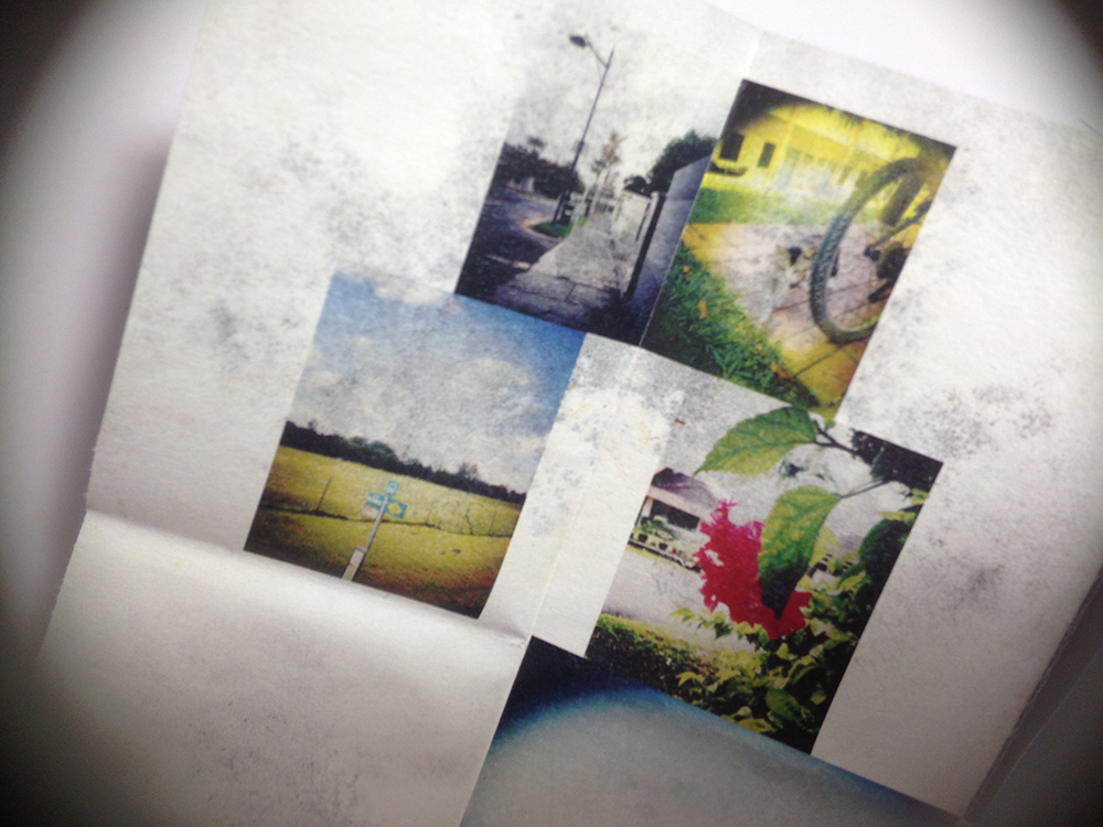
The journal is a repository of memories and events. These are also considered possessions. When I look at my archive again, I find myself looking for something else from the words and drawings that I’ve made over the years. Many times I draw the comparison between the person I am then, and now. These are markings that indicate my growth as a person and a creative.

We collect possessions to comfort ourselves, from addiction and to measure out the passing of our lives. We collect because we are drawn to the subtler pleasure of nostalgia for the recent past, and the memory of far-distant history. We collect sometimes to signal our distress and console ourselves in our inability to deal with the world. These are the motivations that designers need to understand, and the qualities which they manipulate when they create objects, whatever their nominal function.

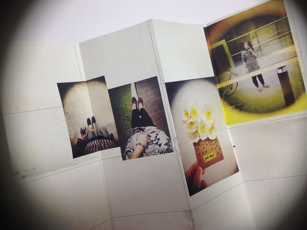
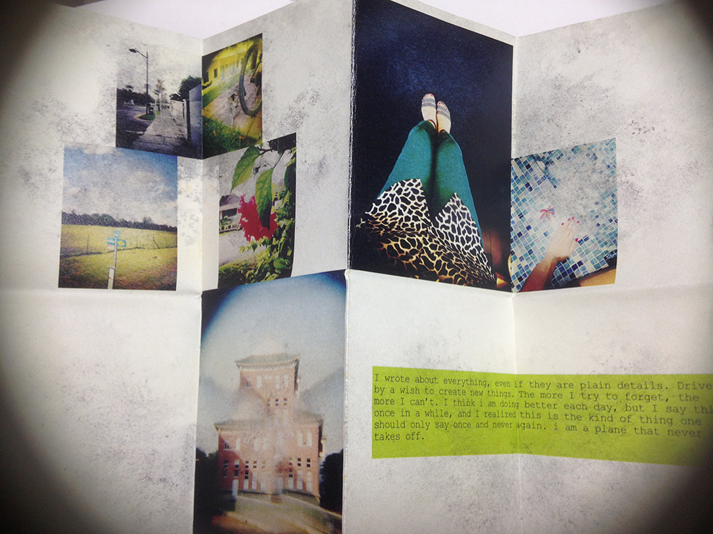
I’m particular drawn to the point he made about distress and consoling ourselves. This year I hardly made any drawings. My journals are filled instead with writing that I made in order to try to understand my own FYP concept better. I also find myself grappling with the struggle of being with a young adult. Time and finance are the resources that have to keep competing with each other, and it makes me feel frustrated. I find that I must divide my time and attention each week to work commitments, FYP, and spending time with friends and family. I look at my older journals and I find that I lost the luxury to make the drawings and writings that I used to. I rarely have the time to feel bored anymore, each moment is dedicated to keeping up with my to-do list. I guess it’s one of the reasons why I needed to deactivate myself from social media. In becoming a young adult, some of these juvenile struggles have definitely (and thankfully) faded away, but along with that, I also lose the need to make artwork about these things. But that’s not to say that I need to be some kind of angsty youth to fuel my creative process. Looking at my journal archive also makes me realise that I sometimes need to not give a damn, and occasionally make some impulsive artwork that makes no sense. To think like a child again.

Collecting is in one sense about remembering, but the digital world never lets us forget anything. Paradoxically, it has also undermined our ability to remember. Our email and text trails will last as long as the server farms that have already conferred a kind of immortality on anybody with a Twitter account.”

This point is definitely relevant to the virtual part of my work. My project is split between my virtual and physical archives. It documents the relationships made online and off.

We remember where we started from online, because the date is recorded when we first made friends on the virtual realm. Green buttons tell me that I know you from a measurable distance. Conversations are trivialized with the advent of animated and very expressive egg man oyster cat girl stickers. Grids of photos let me glimpse into your life and I could say yeah I guess I know you. How many backspaces will it take to bring me back to when there were no green buttons? When your status is set to Away on MSN? Remember the time I told you I was playing The Sims and you told me how you got rid of your Sims? And then you said you were going to build some furniture for your room over the break. And then the conversation ended and the next time I went online there were no traces of the conversation happening. Despite being given a chance to keep an archive of the chat, nobody really goes to the effort to do so. And now we can go back as far as we wish to and point out the beginning of everything. Everything is laid out and easily accessible, pictures and words and the little green circle next to your name. Archiving comes easier for all of us, collecting data is as easy as typing hello to you. The question is how much of this is worth remembering and archiving. You may not remember, but the Internet remembers for you.

Video Double — virtual nostalgia

My video double is a work in progress of an alter ago. This lady is pretty much my ideal self, I think, as an artist, as a personality. She’s got some fun tattoos and beautiful hair. The illustration style is largely inspired by the aesthetics of Palace Doll avatars (from Palace Chat, briefly discussed in Media & performance class last semester), as well as Microsoft Paint. These are some things that influence my early artworks made on the computer, so I wanted to capture a bit of what I remembered and loved, like going crazy with the colour wheel and adding all the colours on my digital palette. Palace Doll avatars were really some stellar pixel artwork. And Microsoft Paint was my virtual art studio before I ever got to play with Photoshop.

Being Together by John Clang


I got this book over the summer. It is an documentation of the solo exhibition of Singaporean photographer John Clang, who is based in New York City. I was introduced to John Clang’s work when I was working on my A Level art project. Some people from Objectifs came down to my art class for a small photography sharing session, and one of the instructors suggested that I might be interested in John Clang’s works. So I went for his exhibition at 2902 Gallery in 2010.

Here’s his artist statement:

“The deeply personal also occupies my work, specifically the themes of memory, identity and longing as a son living overseas for years and separated from my family back home. In series like Erasure and Guilt, I respectively explore the fears when contemplating the death of a loved one, and the guilt of disappointing our loved ones. Explorations of identity can also take a turn for the playful and provocative—as evidenced in lighter series like Beon Sleeps and Me and Friends.”

Like John, my work is largely personal, drawing from my archive of blog entries, and journal pages. Some of the themes that I am looking at also include memory, identity, and fears, on the virtual space as well as in real life.

Previously I was only given a handout of his works, so I was very happy to be able to get this exhibition catalog and see the photographs in full size. I actually found this copy from a small shop selling art books in the Montmarte area of Paris.

Apart from the wonderful works of John Clang, I thought that the publication is extremely well designed. This is the work of Yanda of Do Not Design. Do Not Design is a local creative consultancy who is responsible for some inspiring editorial work, such as the magazine The Design Society Journal. To be honest, I am not very good with catching up with what local design companies to. But I personally really like the work done by Do Not Design.

These are some of my favourite spreads in the book.


Photo 16-8-15 2 11 16 pm Photo 16-8-15 2 11 25 pm Photo 16-8-15 2 12 06 pm Photo 16-8-15 2 12 12 pm Photo 16-8-15 2 12 27 pm Photo 16-8-15 2 12 35 pm Photo 16-8-15 2 12 41 pm Photo 16-8-15 2 12 48 pm Photo 16-8-15 2 13 03 pm Photo 16-8-15 2 13 14 pm Photo 16-8-15 2 13 19 pm Photo 16-8-15 2 13 21 pm Photo 16-8-15 2 13 31 pm

John Clang’s photo-books, including this one, can be purchased from DECK gallery at Prinsep Street.


Holycrap: Renn Lim by Renn Lim


“Renn Lim by Renn Lim” is yet another one of Holycrap’s creative ventures. I really like how this little book is put together, it reminds me so much of my own journals and how I save little scraps of paper and other ephemera that I love a lot.

What I love about Holycrap’s design approach is that they have a very distinctive and original style. They work with what their large archive of material and make an aesthetic out of it. It is absolutely okay to be messy, or when things get stained. From the viewpoint of a book lover and a creative, I think that sometimes it is important to embrace some of the imperfections and make it a part of design. This book is an example of how elements of art, craft, and design can come together and complement each other perfectly, and make the experience of going through the book so pleasant. Books are meant to come in contact with our touch, dog-eared pages and stains are inevitable. Books should feel at home in our hands.


Photo 16-8-15 11 44 44 am

Photo 16-8-15 11 44 48 am Photo 16-8-15 11 45 03 am


Paper bits that are scanned, printed, and deliberately crumpled by hand.Photo 16-8-15 11 45 09 am Photo 16-8-15 11 45 19 am Photo 16-8-15 11 45 24 am Photo 16-8-15 11 45 30 am Photo 16-8-15 11 46 37 am

Super adorable and amazing replica of the envelopes from photo shops. I laid an actual one next to it for comparison. It even folds up like the real thing. Inside the envelopes are small prints of Renn’s paintings.Photo 16-8-15 11 46 44 am Photo 16-8-15 11 46 55 am Photo 16-8-15 11 47 15 am Photo 16-8-15 11 47 21 am Photo 16-8-15 11 47 53 am Photo 16-8-15 11 47 54 am Photo 16-8-15 11 47 56 am

Holycrap: Till Death Do Us Part


Really enjoyed looking at the second famzine by Holycrap. This issue is particularly inspiring for me in terms of the way the contents are being presented. I have been busy scanning some of my journals and other little things. Looking at this work gives me many ideas on how I can present my data in a manner that is true to the medium. Most importantly, how can I capture the ephemeral quality of these things?

Holycrap had a sharing session at Deck two weeks ago and they talked about how the made the second zine. The second famzine is a tribute to the grandparents of Renn and Aira, a celebration of the older Lims’ 50th wedding anniversary. The cover design is an old Chinese National Language School folder, which was scanned and redesigned to fit the mini-books.Photo 16-8-15 11 39 52 am Photo 16-8-15 11 40 01 am Photo 16-8-15 11 40 07 am

Absolutely charming details being put into this work. Each copy of the zine is individually hand-stamped with the title of the work. And then the folder is intentionally “wrecked” and taped over to give the worn look. If you look closely, the yellow stains are actually scans from the actual folder. It is all very realistic. I’m interesting in going for this design approach with regards to my work because I think the data cannot be simply arranged on InDesign, printed, and that’s it.Photo 16-8-15 11 40 19 am Photo 16-8-15 11 40 24 am

Inside the folder is a 5-part book series with different chapters for their findings. What a brilliant and unique way of designing.Photo 16-8-15 11 40 32 am Photo 16-8-15 11 40 39 am Photo 16-8-15 11 40 45 am Photo 16-8-15 11 40 51 am Photo 16-8-15 11 40 53 am

Photo 16-8-15 11 40 57 am Photo 16-8-15 11 41 03 am Photo 16-8-15 11 41 08 am Photo 16-8-15 11 41 11 am Photo 16-8-15 11 41 13 am Photo 16-8-15 11 41 20 am Photo 16-8-15 11 41 23 am Photo 16-8-15 11 41 28 am Photo 16-8-15 11 41 34 am Photo 16-8-15 11 41 42 am Photo 16-8-15 11 41 46 am


Mini (super realistic) replicas of ephemera makes for a very engaging and intimate experience when going through this work.Photo 16-8-15 11 42 05 am Photo 16-8-15 11 42 10 am Photo 16-8-15 11 42 17 am Photo 16-8-15 11 42 23 am Photo 16-8-15 11 42 28 am Photo 16-8-15 11 42 36 am Photo 16-8-15 11 42 41 am Photo 16-8-15 11 42 50 am

Holycrap: Google Translating Tokyoto


A good friend gave me the brilliant Rubbish Famzines by Holycrap. I’ve been looking through this over the last few weeks. These are some really inspirational work in terms of design and documentation which I will be looking at quite plenty for reference in the course of my FYP.

Holycrap is a local art collective made up of Pann Lim, Claire Lim, and their two children Renn and Aira. They have been making the Rubbish Famzines for two years now and recently launched their fourth famzine entitled “The Incomplete Herbarium and Other Garden City Exploits”.

A few weeks ago, I had a chance to listen to the family share about their project and how they work together to make these brilliant famzines. The family defines the famzines as a family magazine, a compilation of all that they find interesting and memorable to them as a family.

Photo 16-8-15 1 20 29 pm

Holycrap at DECK two weeks ago.Photo 16-8-15 11 43 22 am

Google Translating Tokyoto is the first famzine that they made in 2013. It is a brilliantly pink book documenting their first trip together as a family. Some pages from the zine.Photo 16-8-15 11 43 19 am  Photo 16-8-15 11 43 30 am

Incorporating screenshots, film photos and text.Photo 16-8-15 11 43 47 am

Never thought of it, but QR codes are actually a brilliant way of incorporating virtual content with print. During the talk, the family demonstrated the use of these QR codes, which leads to funny YouTube videos and Vimeo clips. Photo 16-8-15 11 43 55 am Photo 16-8-15 11 44 07 am Photo 16-8-15 11 44 13 am Photo 16-8-15 11 44 33 am

Instadiaries


My friend said this to me lately, “Beverley, when I look at your Instagram, you don’t seem to have photos of you and your friends. You make others think that you are better off living life by yourself, with your objects and whatever it is you are making.”

It was a timely thing to hear that from her, as I recently rediscover an old project that I made some time ago called Instadiaries. I made it when I started clearing my iPhone camera roll and found that there are many images I’ve captured which I had intended to share on my Instagram but I didn’t, because they didn’t fit in with the rest of the pictures I had already posted.

I would say this project makes me think about my participation on the virtual space and how that affects my way of documentation over recent years. When I write on my personal blog, I always feel that I am making conversation with a virtual abyss, and I never really feel that I had to censor myself or curate my words. If I were unhappy with myself, I could be very honest about what it is that made me unhappy and then I will read what I wrote again the following day and I could make a change about myself. I know there is not really anybody out there who is a constant reader of my blog. People are generally more interested in the pictures shared on Instagram or Facebook. But when I share a photo on my Instagram, I know that people do look at it and respond to it. And because I know it isn’t an entirely complete representation of who I am, sometimes I would rather not share at all.

Maybe some of us have experienced this phenomenon that seem to have taken over the users of Instagram at some point. We become quite particular about the way our pictures look on Instagram. Some users prefer to keep the original aspect ratios of their photos, square crops be damned. Some are really good at doing flat lays and enjoy arranging objects in a neat, stylish fashion to demonstrate their taste. The list goes on. There is nothing wrong with this, and some users have an attractive feed for their specific interests because of their careful curation. At one point, I was also very particular about how my pictures look together on Instagram, which made me wonder why I should. It is quite pretentious and honestly there were plenty of pictures that I would like to share online but I didn’t. I thought of how people enjoy the feed that I was sharing then, and something different might make them disinterested. More than that, I was ashamed to admit that I could allow social media to influence my decision in something so trivial such as sharing a photo I like a lot. So, as a result, I deleted my Instagram for a while, and made a project about it.

I collated some of my favourite photos taken in a month (the project unfortunately lasted for only about three months), and added some of the writing I made in the month as well.

Some pictures of the project:


Photo 16-8-15 11 34 01 am Photo 16-8-15 11 34 22 am

Each Instadiary is A4 size, printed on both sides on Ikea paper.Photo 16-8-15 11 34 38 am Photo 16-8-15 11 34 54 am

Some poor experimentation of layout.Photo 16-8-15 11 35 00 am Photo 16-8-15 11 35 16 am Photo 16-8-15 11 35 25 am Photo 16-8-15 11 35 30 amI think this could be something I can continue to look into. I’m not so much interested in the implications of social media or looking deep into how that affects our relationship with one another, but I am definitely keen on researching how that affects the way we look and present ourself. I also want to make comparisons between this manner of sharing with what I started wit: blogging and making friends on Internet forums.