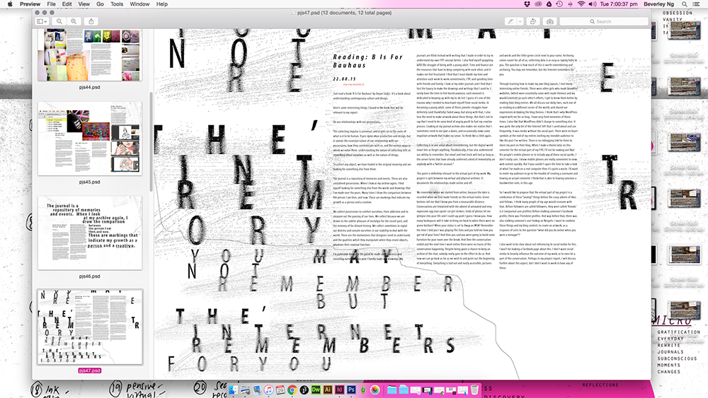
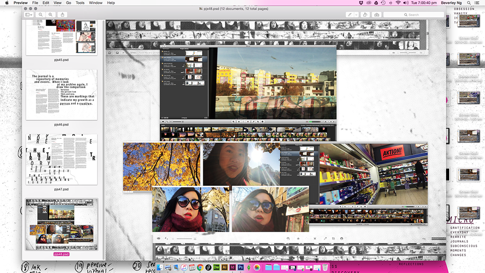
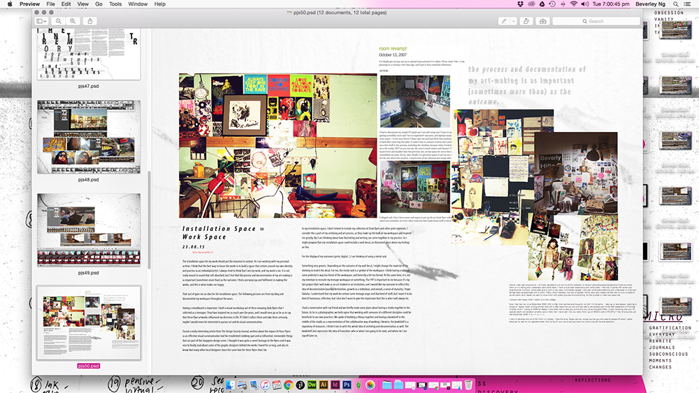
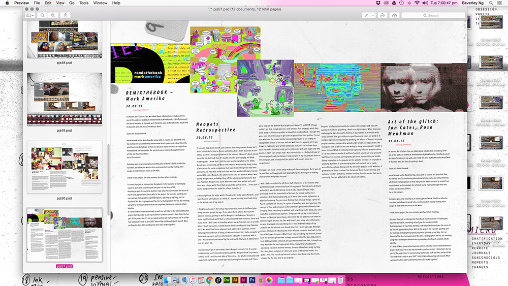
photoshop spreads + videos

Screen Shot 2016-03-29 at 7.00.36 pm Screen Shot 2016-03-29 at 7.00.37 pm Screen Shot 2016-03-29 at 7.00.40 pm Screen Shot 2016-03-29 at 7.00.42 pm Screen Shot 2016-03-29 at 7.00.45 pm Screen Shot 2016-03-29 at 7.00.47 pm Screen Shot 2016-03-29 at 7.00.50 pm Screen Shot 2016-03-29 at 7.00.53 pm

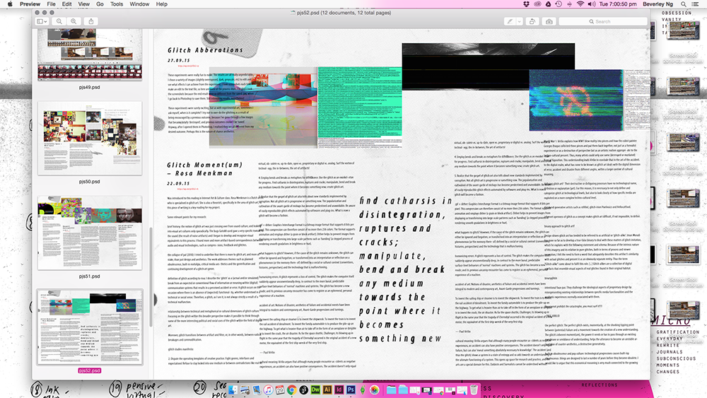
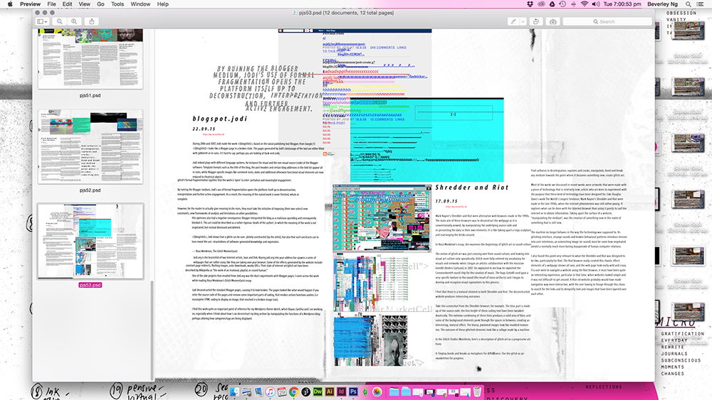
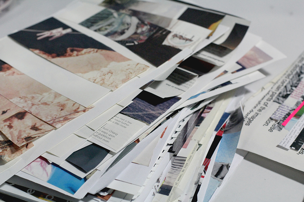
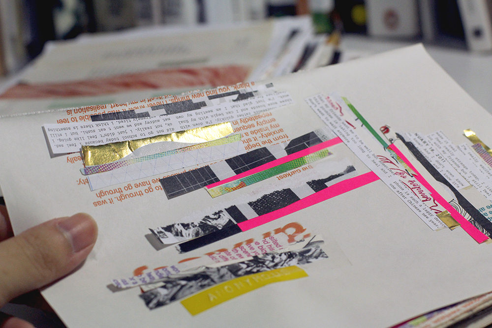
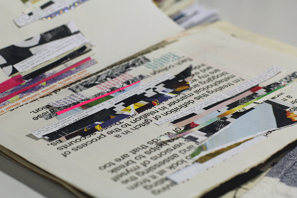
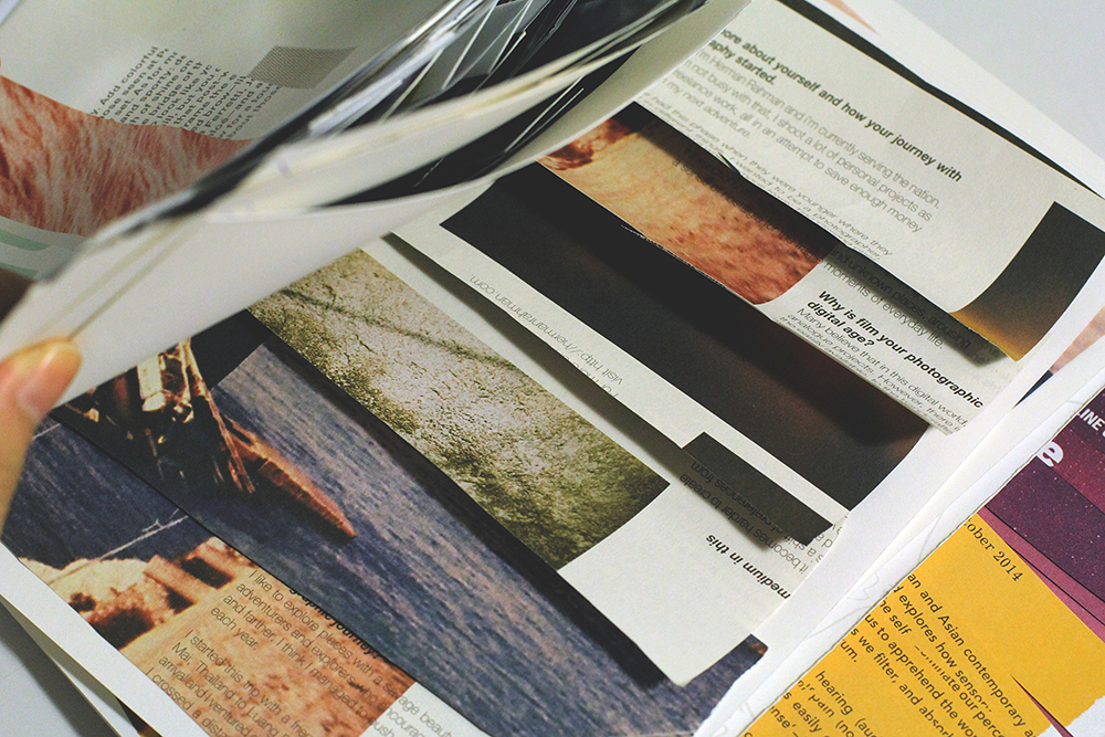
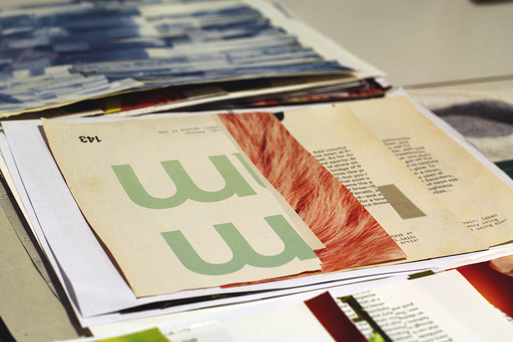
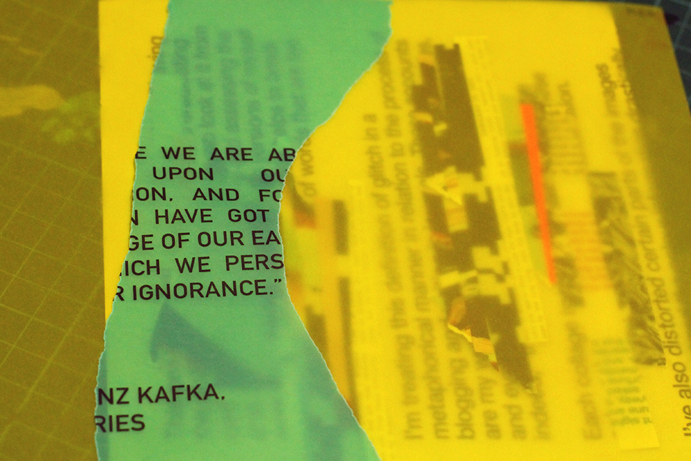
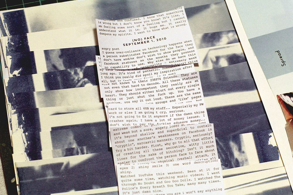
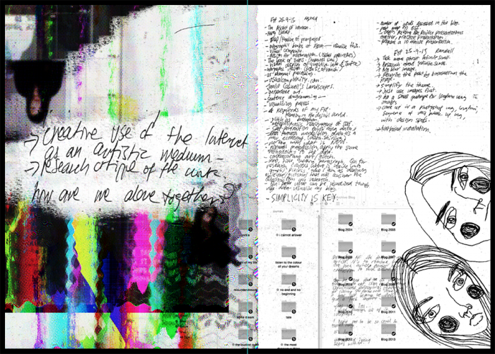
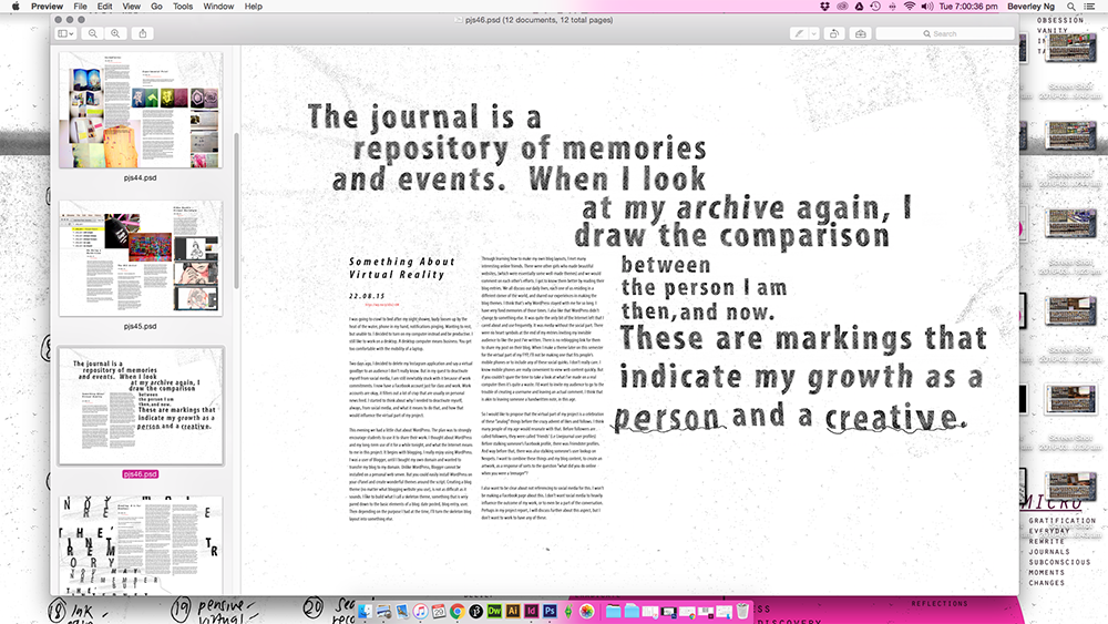
I’ve finished putting together my physical process books, and my challenge for the last two weeks was thinking about how to present my OSS and video documentations. Opened up InDesign and played around with some layouts. Truth be told, I don’t like InDesign. When I open it, the interface makes me feel like I ought to be putting things in neat, orderly fashion. Grids and columns stresses me out. I haven’t quite had the energy to try and make friends with InDesign yet. Perhaps not now. I left work on hold for the past week and sank into a pitiable state of self-pressure. No one is stressing me out or doubting me, but my own search for perfection is wearing me out. I went back to the comfort of Photoshop to make the spreads instead and I felt better than I had in weeks. I am reminded how enjoyable it was to make layouts in Photoshop with nobody to tell me how to put things in order. It was what this whole project is about: to go back, re-love, rediscover old methods of working, to find what made my art process work, and hold on to it.

Anyway, making the process book was really fun. I always feel happy every time I hold the prototype in my hands.


Micro-Project: Glitched Abberations

These experiments were really fun to make. The results are all really unpredictable. I chose a variety of images (slightly overexposed, dark, greyscale, etc) to edit and see what effects I can achieve from the experiment. I took screenshots each time I make an edit to the text file, so here are some of the process shots. I’m glad I took the screenshots because the end result were so different from the saved .jpg, when I go back to Photoshop to save them. Still interesting results, nonetheless!104grrb01

I started off by editing only the top part of the code, which seem to break the image into monochromatic layers. I like the result of this one, it really transform the original image into something quite exciting.103grrb02

The colours in this photo is rather flat and faded. For the next image, I scrolled down all the way to the bottom and edited the code there. The effect was comparably drastic to the first: after a second edit, the image became a series of lines. The lines were also quite flat, nothing very saturated, like the original photo.55grrb04

Next, I tried a greyscale photo. The result is absolutely exciting.  It’s quite interesting to see how this one produced such a colourful results. My favourite part is how the glitchy lines, after rounds of edits, became a smooth streak of gradient.28grrb06

This is one of the more exciting result out of all the images I’ve tried. It has the same result as the greyscale photo; both have streaky gradient glitch lines, but what is interesting is how at one point of the edit, the “glow” of the text seemed to be separated from the text itself, creating a ghostly glitchy effect. It kind of reminds me of what you can do with slow shutter speed on a camera.38grrb05

This one looks like a 3D image. After the first edit, the result didn’t seem to change too much, the image just separates into different segments.

Here are the images opened in Photoshop:glitchab01 glitchab02 glitchab03 glitchab04   glitchab07

These experiments were surely exciting, but as with experimental art, sometimes I ask myself, when is it complete? I try not to over-do the glitching as a result of being encouraged by a previous outcome, because I’ve gone through a few images that became totally ‘destroyed’, and previous outcomes couldn’t be ‘saved’. Anyway, after I opened them in Photoshop, I realised they are all different from my desired outcome. Perhaps this is the nature of chance aesthetics.
blogspot.jodi

jblog_01 jblog_02 jblog_03

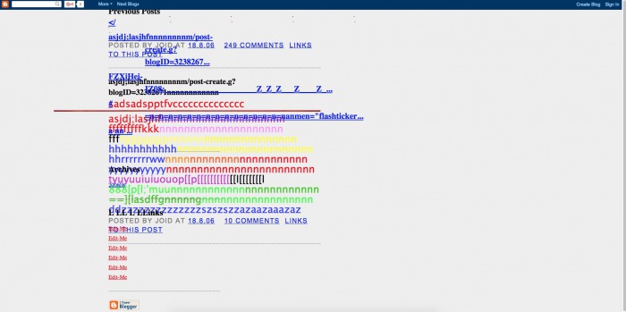
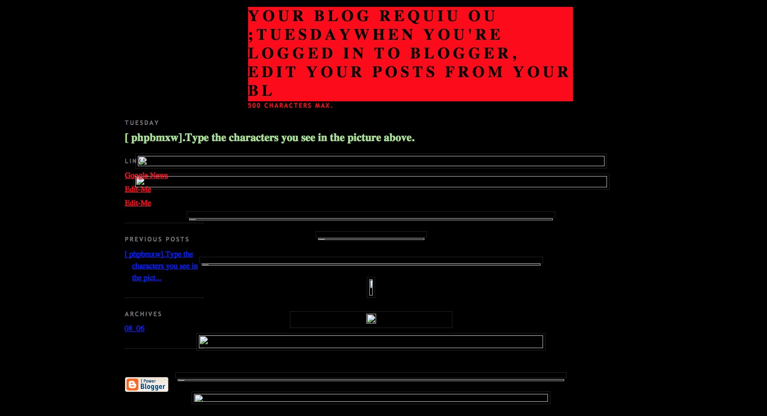
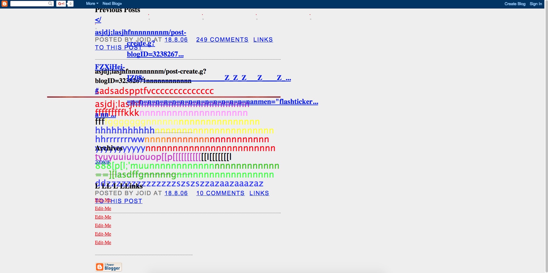
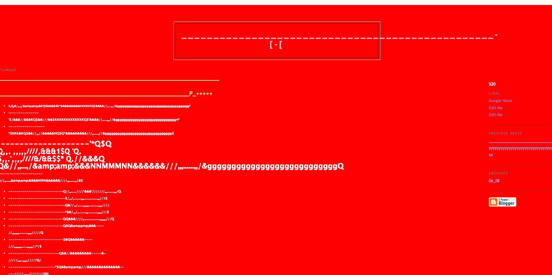
During 2006 and 2007, Jodi made the work <$blogtitle$>, based on the social publishing tool Blogger, from Google.13 <$blogtitle$> looks like a Blogger page in a broken state. The pages generated by Jodi’s (mis)usage of the tool are either filled with gibberish or in ruins. It’s hard to say: perhaps you are looking at back-end code.
Jodi indeed plays with different language systems, for instance the visual and the non-visual source (code) of the Blogger software. Template formats such as the title of the blog, the post headers and certain blog addresses in the link list appear all in ruins, while Blogger-specific images like comment-icons, dates and additional otherwise functional visual elements are now reduced to theatrical objects.

glitch’s formal fragmentation signifies that the work is ‘open’ to inter- pretation and meaningful engagement.

By ruining the Blogger medium, Jodi’s use of formal fragmentation opens the platform itself up to deconstruction, interpretation and further active engagement. As a result, the meaning of the ruined work is never finished, whole or complete.

However, for the reader to actually give meaning to the ruins, they must take the initiative of imposing (their own select) new constraints, new frameworks of analysis and limitations on other possibilities.

this openness also had a negative consequence: Blogger interpreted the blog as a malicious spamblog and consequently blocked it. This act could be described as a rather rigorous ‘death of the author’, in which the meaning of the work is not negotiated, but instead dismissed and deleted.

<$blogtitle$>, Jodi shows that a glitch can be com- pletely constructed (by the artist), but also that such constructs can in turn reveal the con- structedness of software-generated knowledge and expression.

— Rosa Menkman, The Glitch Moment(um)

Jodi.org is the brainchild of two Internet artists, Joan and Dirk. Keying jodi.org into your address bar spawns a series of webpages that are rather crazy, like they are taking over your browser. Some of the effects generated by the website include: constant page redirects, flashing images, auto-downloads, wacky URLs. Their style of internet art/glitch art have been described by Wikipedia as “the work of an irrational, playful, or crazed human.”

One of the side projects that resulted from Jodi.org was the duo’s experiments with Blogger pages. I came across the work while reading Rosa Menkman’s Glitch Moment(um) essay.

Jodi deconstructed the standard Blogger pages, causing it to look broken. The pages looked like what would happen if you enter the source code of the pages and remove some important parts of coding, that renders certain functions useless (i.e incomplete HTML coding to display an image, that resulted in a broken image icon).

I find this work quite an important point of reference for my WordPress theme sketch, which Boyan, Cynthia and I are working on, especially when I think about how I can deconstruct my blog archive by manipulating the functions of a WordPress blog: perhaps altering how categories/tags are being displayed.


Research Critique 5: Shredder and Riot


shredder02shredder01 shredder03 shredder04

Shredder, 1998


shredder05 riot01 riot02

Riot, 1999

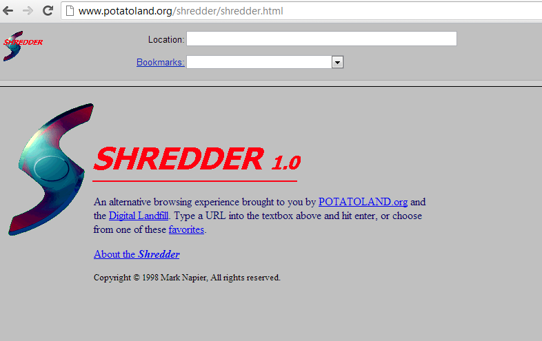
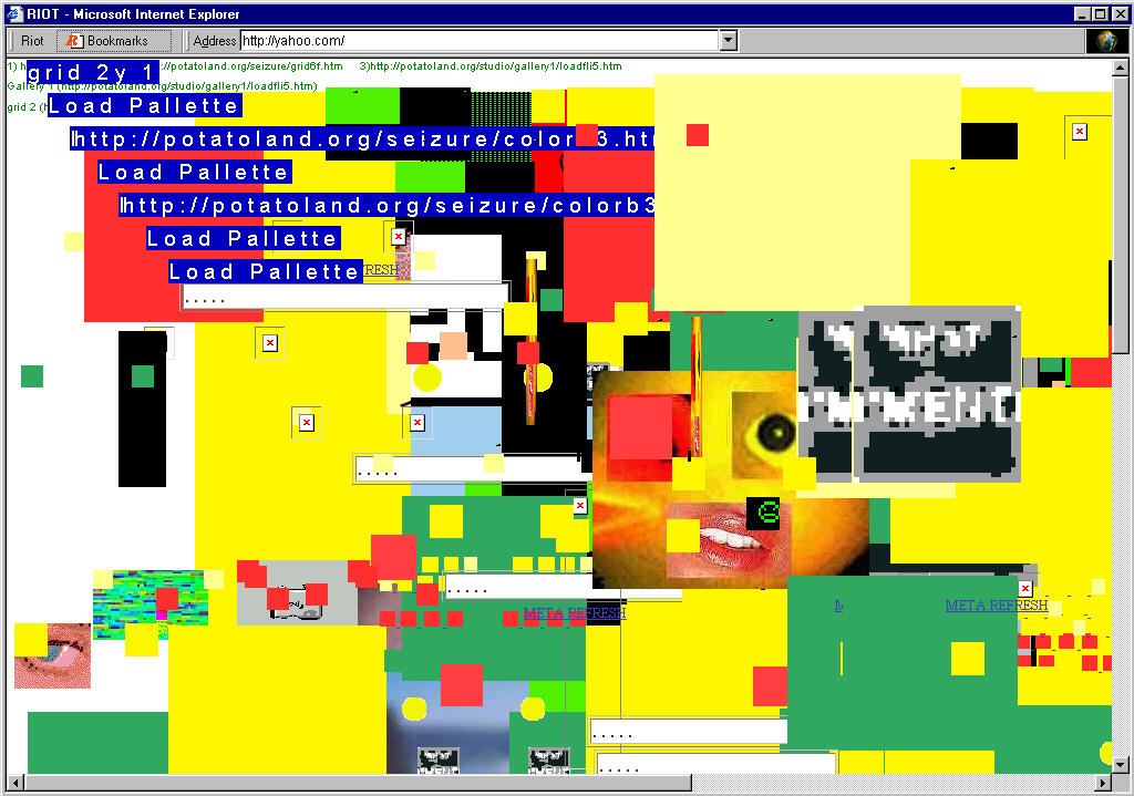
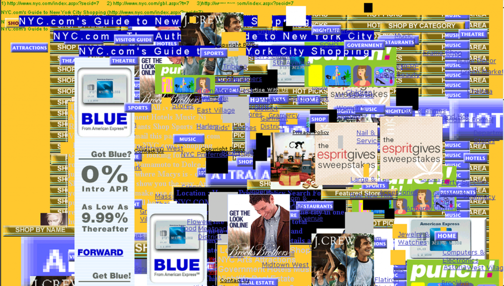
Mark Napier’s Shredder and Riot were alternative web browsers made in the 1990s. The main aim of these browsers was to deconstruct the webpage as it is conventionally viewed, by manipulating the underlying source code and re-presenting the data in their own elements. It is like taking apart a Lego sculpture and rearranging the bricks around.

In Rosa Menkman’s essay, she examines the beginnings of glitch art in sound culture:

The notion of glitch art was just crossing over from sound culture, and leaking into visual art culture only sporadically. Glitch more fully entered my vocabulary for visuals and networks when I began an artistic collaboration with the musician Goto80 (Anders Carlsson) in 2007. He explained to me how he exploited the Commordore64 sound chip for the creation of music. The bugs Goto80 used gave a very specific texture to the sound (the result of noise artifacts) and I began to develop and recognize visual equivalents to this process.

I feel that there is a textural element to both Shredder and Riot. The deconstructed website produces interesting outcomes.

shredder03

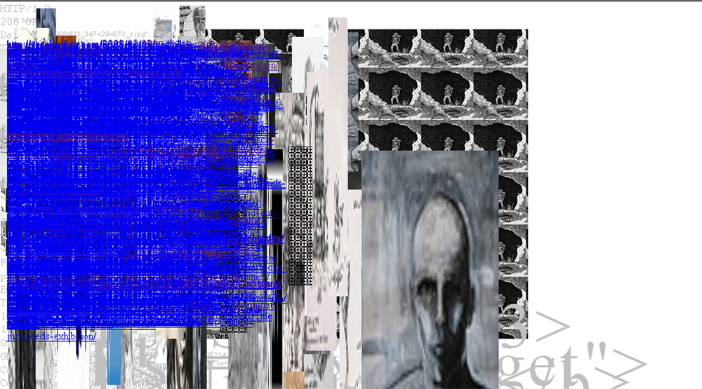
Take this screenshot from the Shredder browser, for example. The blue part is made up of the source code: the line height of these coding text have been tweaked drastically. The extreme condensing of these lines produces a solid area of blue, and some of the background elements peek through the spaces in between, creating an interesting, textural effect. The blurry, pixelated images look like marbled texture too. The outcome of these glitched elements look like a collage made by a machine.

In the Glitch Studies Manifesto, here’s a description of glitch art as a progressive art form:

4. Employ bends and breaks as metaphors for différance. Use the glitch as an exoskeleton for progress.

Find catharsis in disintegration, ruptures and cracks; manipulate, bend and break any medium towards the point where it becomes something new; create glitch art.

Most of the works we discussed in recent weeks were artworks that were made with a piece of technology that is relatively new; artists who are keen to experiment with the purpose that these kind of technology have been designed for. Like Douglas Davis’s work The World’s Longest Sentence, Mark Napier’s Shredder and Riot were made in the late 1990s, when the Internet phenomenon was still rather young. It explores what can be done with the Internet browser than using it purely to surf the internet or to obtain information. Taking apart the surface of a website, “manipulating the medium”, was the creation of something new in the realm of something that is still new.

The machine no longer behaves in the way the technology was supposed to. Its glitching interface, strange sounds and broken behavioral patterns introduce tension into user intentions; an astonishing image (or sound) must be some how negotiated amidst a normally much more boring masquerade of human computer relations.

I also found this point very relevant to what the Shredder and Riot was designed to be like, particularly for Riot. The Riot browser really created this chaotic effect: elements of a webpage strewn all over, and the web page look really wild and crazy. If a user were to navigate a website using the Riot browser, it must have been quite an interesting experience, particular in that time, when websites looked simple and it was not diffucult to get around. A Riot-ed website probably would have made navigation way more interactive, with the user having to forage through this chaos to search for the links and to demystify text and images that have been layered over each other.


Together in Electric Dreams


tgt03

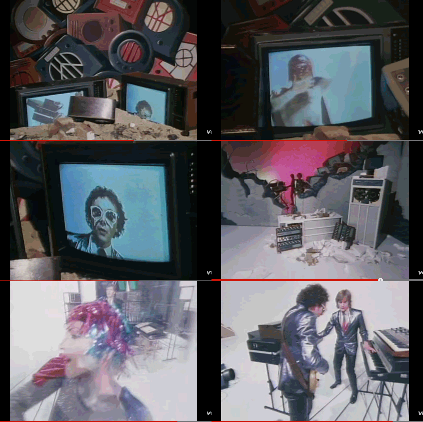
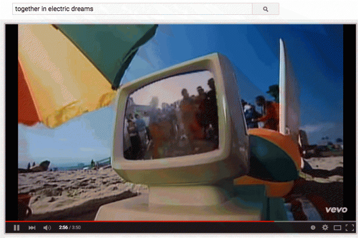
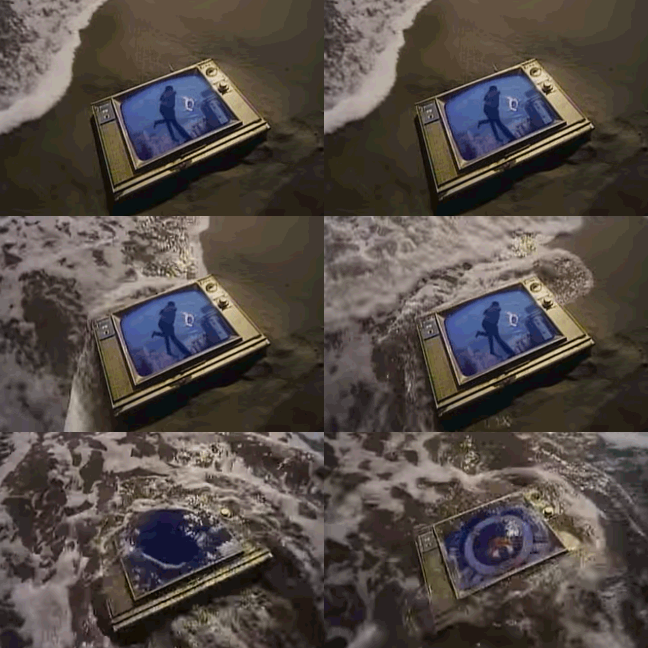
Spent the last few days looking at stuff on the internet for my WordPress theme sketch. Anyway, here’s a song that I like a lot called Together In Electric Dreams, by Philip Oakey and Giorgio Moroder. It’s from a film called Electric Dreams (which I’ve never seen…). The film is about a love triangle between a man, a woman and a computer. Computer becomes involved in man’s love life, and both shared a mutual love for the woman. Eventually the computer accepts the love between the humans and then self-destructs as a results.

The movie is made in 1984, when computers are still quite a new thing. I thought it is quite fascinating for the director Steve Barron to come up with such a storyline that humanizes the machine. There are definitely many films out there are does the same thing with machines and electronics, but perhaps few that envisioned the machines to mimic the emotions that we go through.

Electric Dreams was definitely an attempt to try and weave the early eighties music video genre into a movie.”

— Steve Barron, director of Electric Dreams

After watching the video, I went to look up some of the other popular 80s music that I kind of like, and I find that there’s a very distinctive aesthetic that runs through the videos: fascination of machines and electronics, saturated colours, a glowy, blurry effect all around.

Here’s another one I found by The Buggles, Video Killed the Radio Star

videoradio01

I personally enjoy the aesthetics of these music videos. They are comparably low-fi music videos, unlike much of modern music videos. (Do people still watch those stuff?) And these musicians are all singing about this new form of technology with a kind of wide eyed wonder. I thought maybe for my WordPress theme sketch and my final illustration piece, I could try and dig out what are the aspects of the Internet world that I was acquainted with that strikes me with the same feelings. I think that would help bolster my concept for the theme creation.


Recycled mix process

IMG_9550  IMG_9562 IMG_9563 IMG_9564 IMG_9565 IMG_9566 IMG_9567


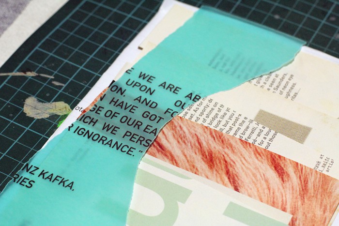
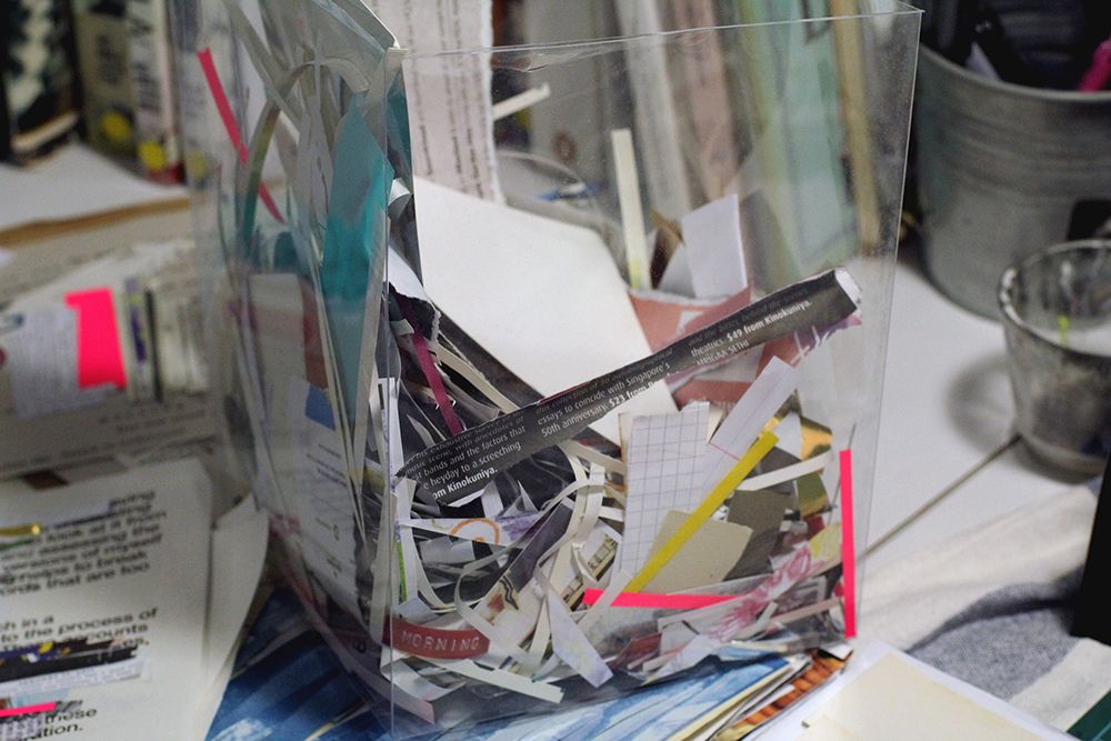
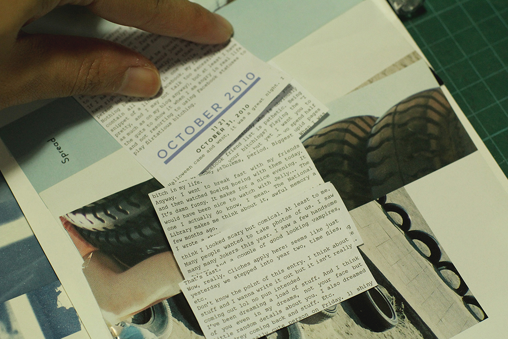
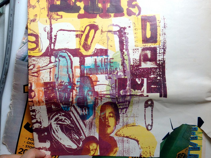
I’ve been making stacks of these collages, from torn magazine papers. Trying to layer different patterns and elements to form a texture, which will be the background for the type from my blog. Will make a couple of spreads this weekend.IMG_9570IMG_9568  IMG_9571 IMG_9575

Thinking about layering text over the collage surface to give it some dimension rather that having it all printed on the page.


IMG_9576 IMG_9577


Experimental print

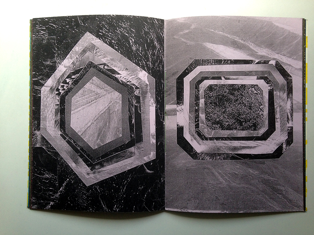
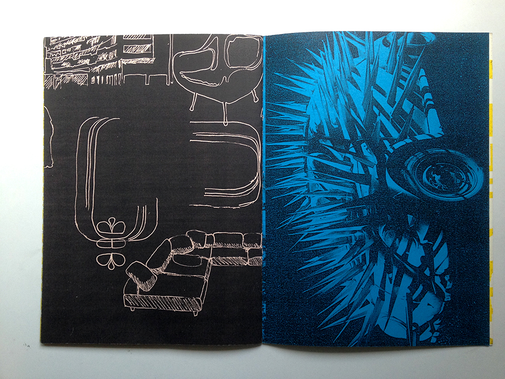
Today I am sharing two publications: a zine with no name that I bought from Ti Pi Tin, and an alternative music magazine called Ray Gun.

Both are inspirational to me in terms of their experimental methods.

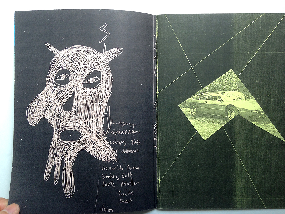
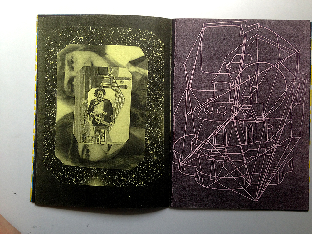
Here’s the zine with no name:Photo 16-8-15 2 10 04 pm Photo 16-8-15 2 10 08 pm Photo 16-8-15 2 10 13 pm Photo 16-8-15 2 10 20 pm Photo 16-8-15 2 10 26 pm Photo 16-8-15 2 10 34 pm Photo 16-8-15 2 10 39 pm

It is very simply made, staple bound, printed with a photocopier on generic coloured paper. I like it a lot because I thought it looks quite polished and cool for a zine that is made with a photocopier. It makes me think about how it is possible to use such low-cost methods to produce a print work that does not discount on quality. The images used in the zines have a good range of tonal values, and the black produced by the printer is rich and saturated.

I personally feel that in my experience of learning design and making publications, it is constantly implied that in order for work to achieve a polished look, it is necessary to invest (i.e spend a lot of money) in materials and printing. What does looking polished even means? I also hear a lot of my peers complaining about shops that don’t do good printing. I don’t completely disagree, but I find that as creatives we must be resourceful and work around what is perceived as weaknesses and turn them into something worthwhile. Given the right resources, most of us are able to make outstanding publications. But I also think it will be quite fun and challenging  if we were to make publications using low-fi methods such as collaging, stamping, scanning, or experimenting with the photocopier. Does good design = expensive paper + printing + hours of working on InDesign + referencing Behance portfolios to death?

Anyway I don’t really believe in that and I would want to try something like this for my FYP.

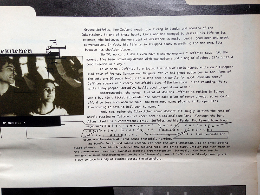
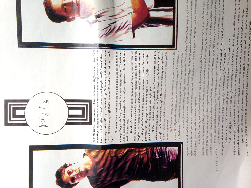
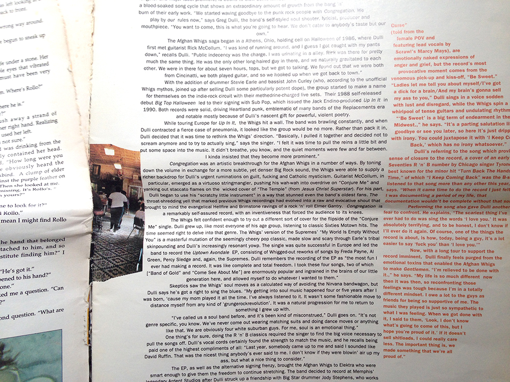
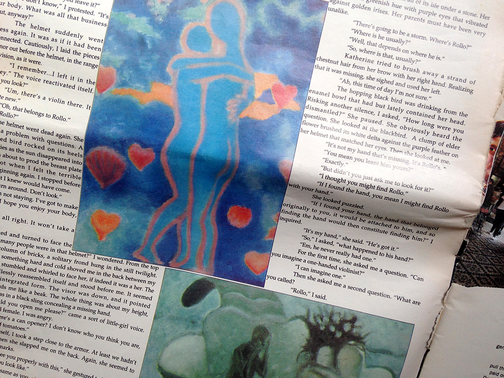
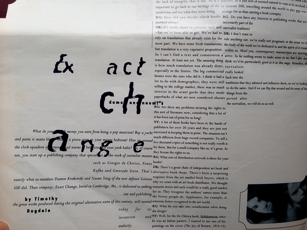
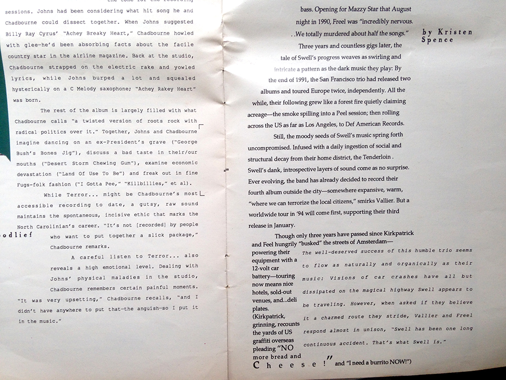
The second publication I’m sharing is called Ray Gun, which is an alternative music magazine which had since ceased its run. The magazine’s editorial designer was David Carson. There is something very distinctively 90’s about the design work. I remember seeing these magazines in my cousins’ room when I was much younger. Both of them are trained in graphic design, and their own works have a bit of David Carson in them. I managed to salvage just one magazine many years ago from their home when they moved out and it has remained one of my go-to publications for design inspiration for a long time.

The type in this magazine is absolutely awesome. Text in a single article can have varying kerning and line height, which makes for an exciting visual experience.

Everytime I have to make some boring work that requires me to put some text and images side by side, I always ask myself, how do I make this thing look cool? I always reach out for this magazine and I feel inspired.Photo 16-8-15 2 18 50 pm Photo 16-8-15 2 18 58 pm Photo 16-8-15 2 19 12 pm Photo 16-8-15 2 19 20 pm Photo 16-8-15 2 19 29 pm Photo 16-8-15 2 19 34 pm Photo 16-8-15 2 19 40 pm Photo 16-8-15 2 19 55 pm