photoshop spreads + videos

Screen Shot 2016-03-29 at 7.00.36 pm Screen Shot 2016-03-29 at 7.00.37 pm Screen Shot 2016-03-29 at 7.00.40 pm Screen Shot 2016-03-29 at 7.00.42 pm Screen Shot 2016-03-29 at 7.00.45 pm Screen Shot 2016-03-29 at 7.00.47 pm Screen Shot 2016-03-29 at 7.00.50 pm Screen Shot 2016-03-29 at 7.00.53 pm

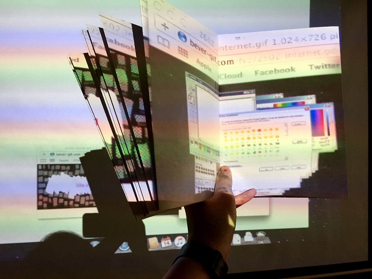
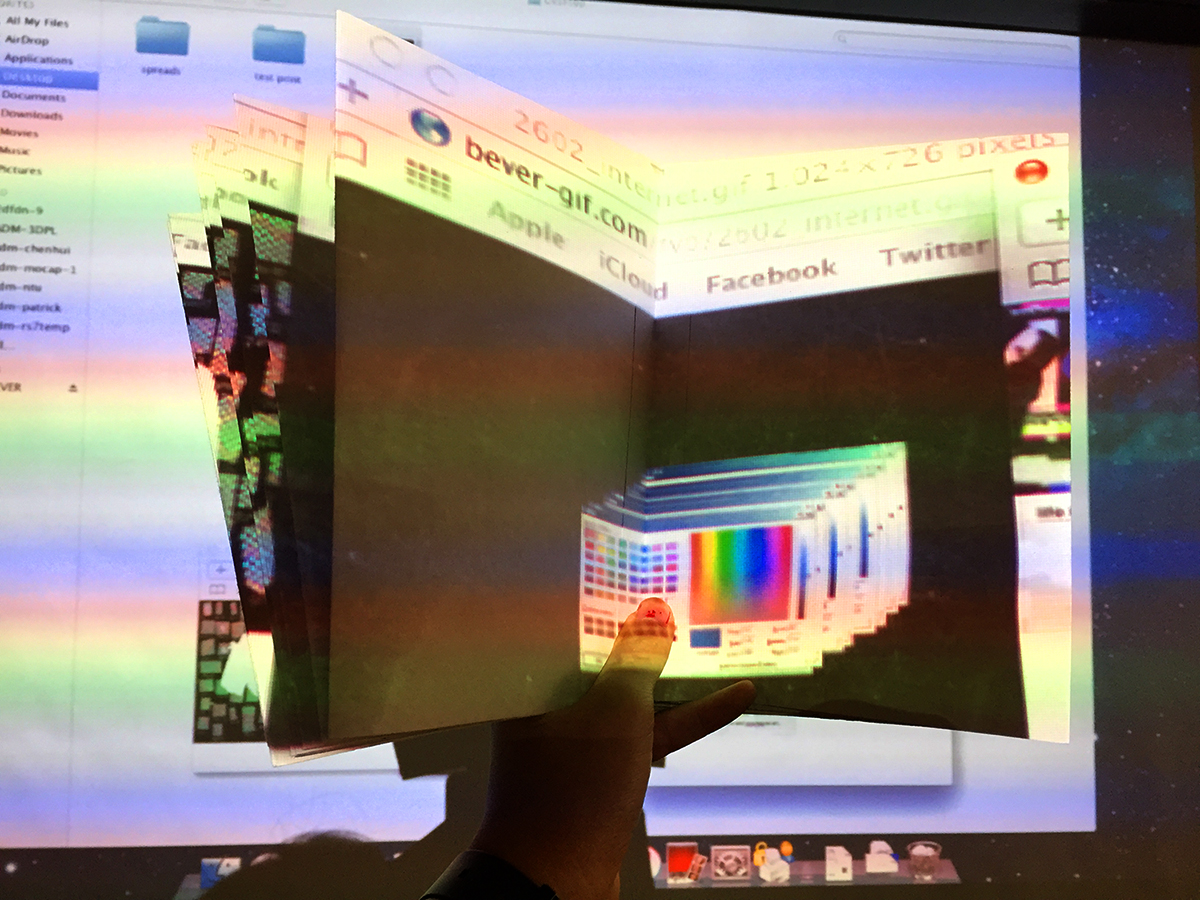
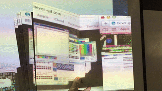
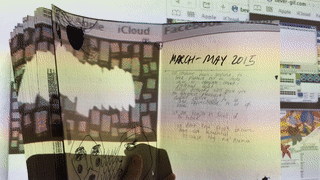
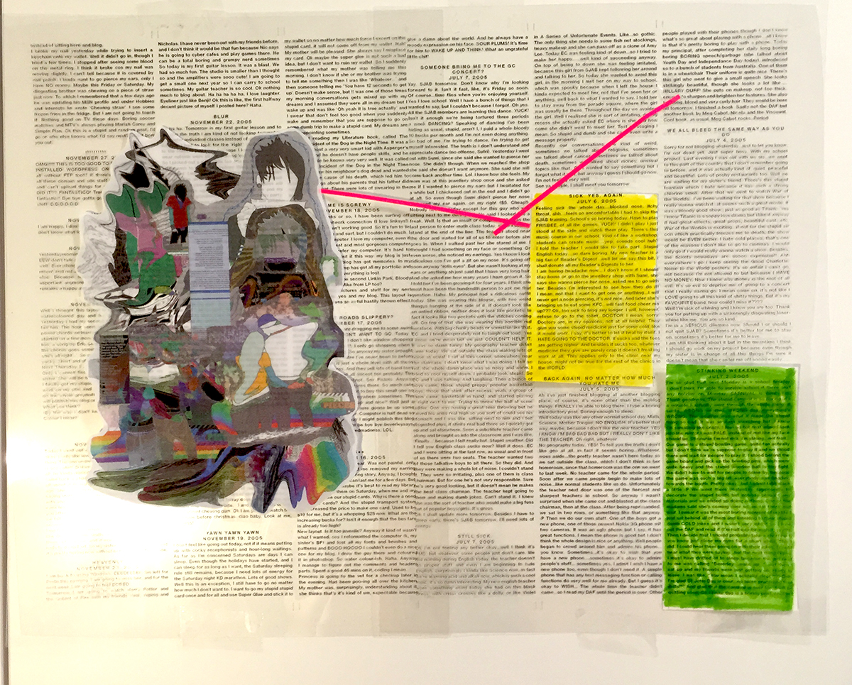
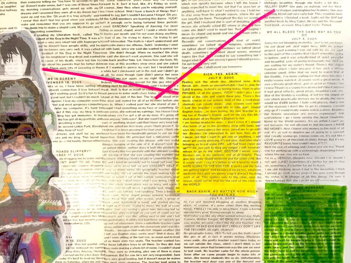
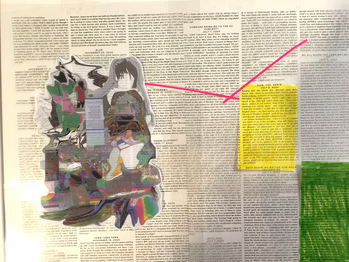
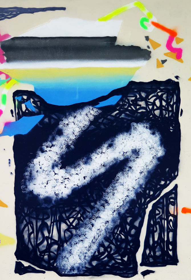
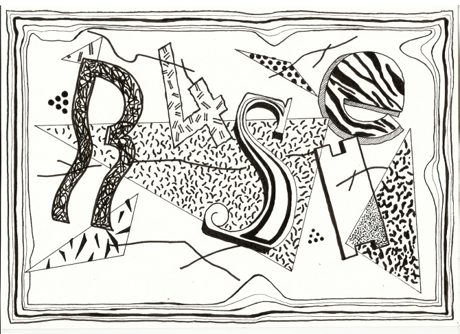
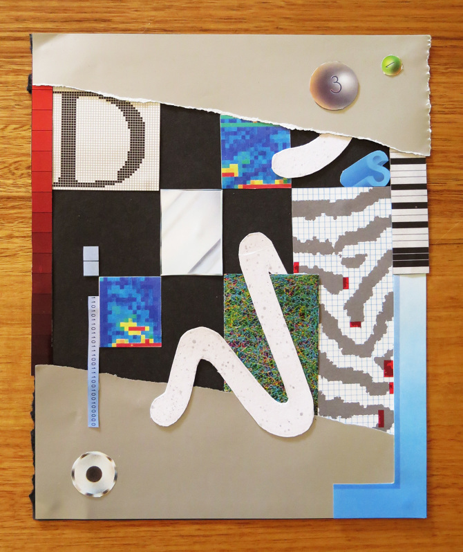
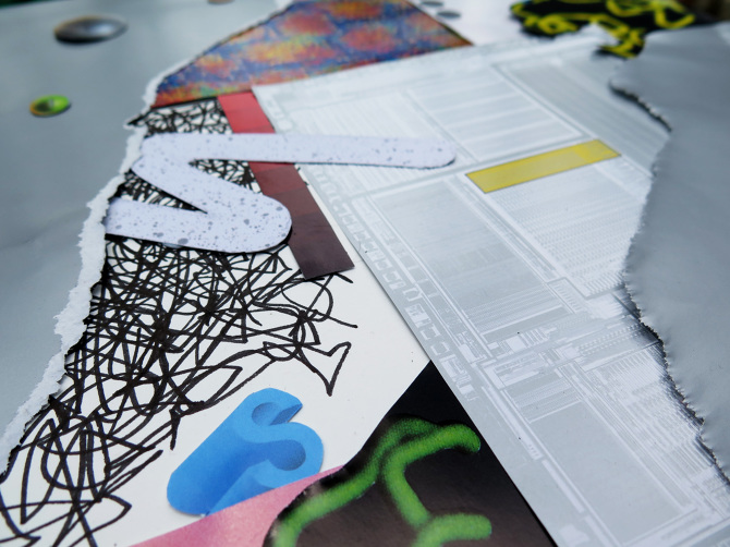
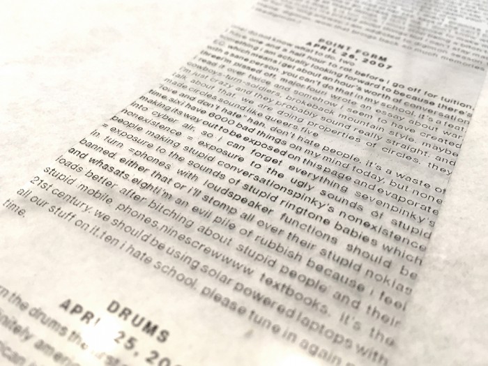
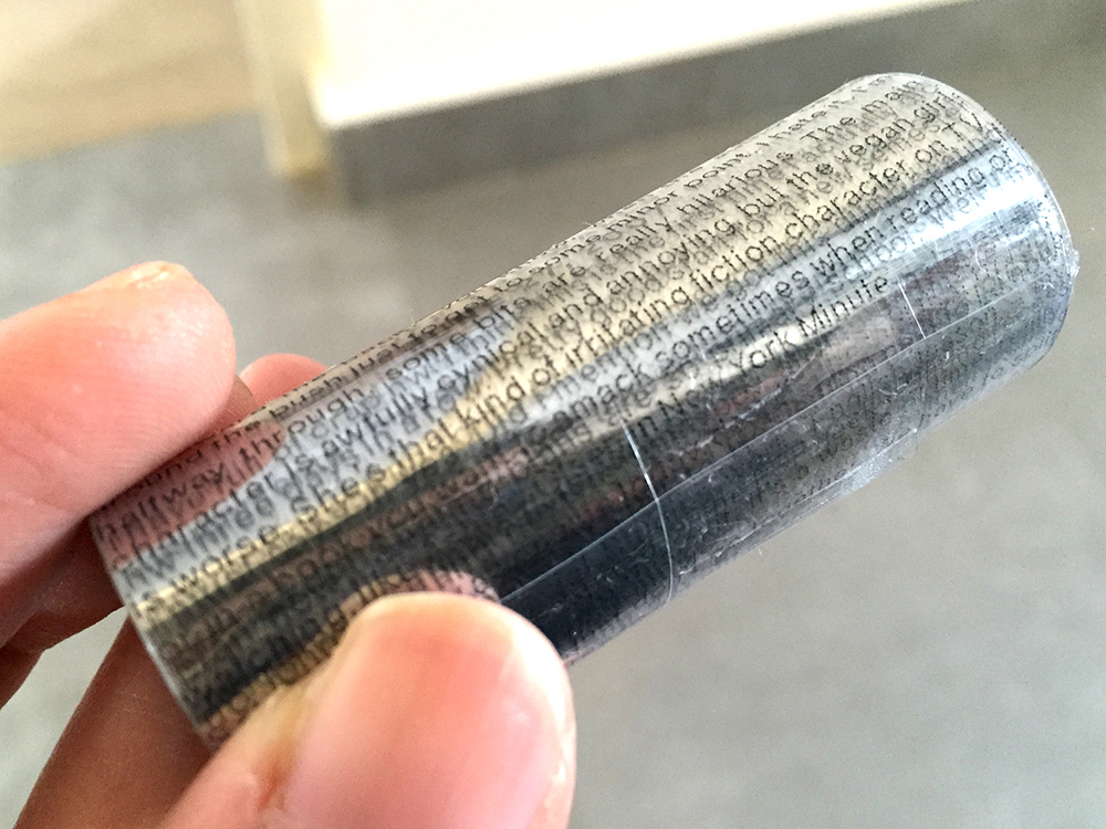
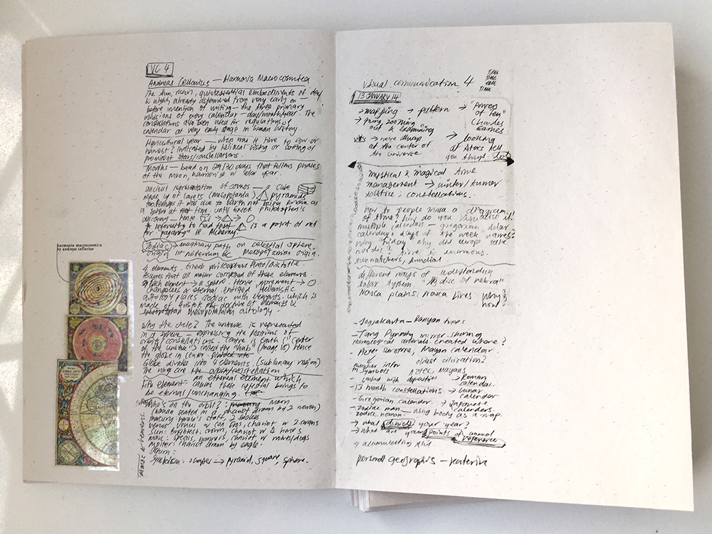
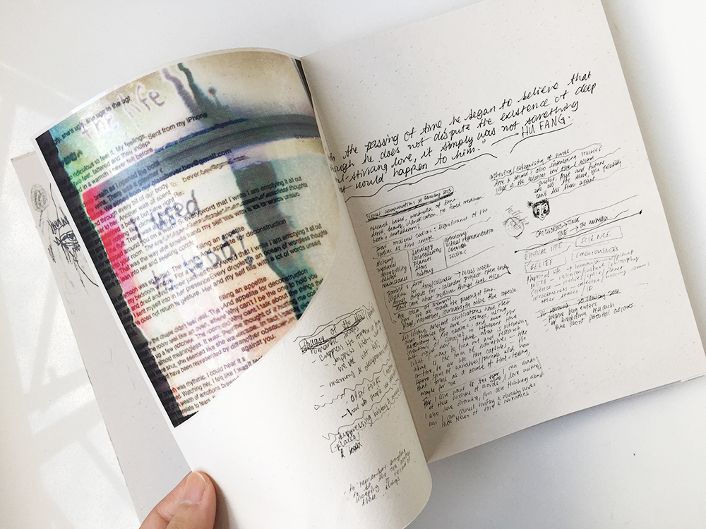
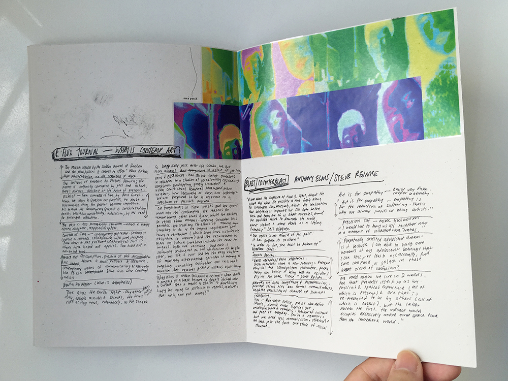
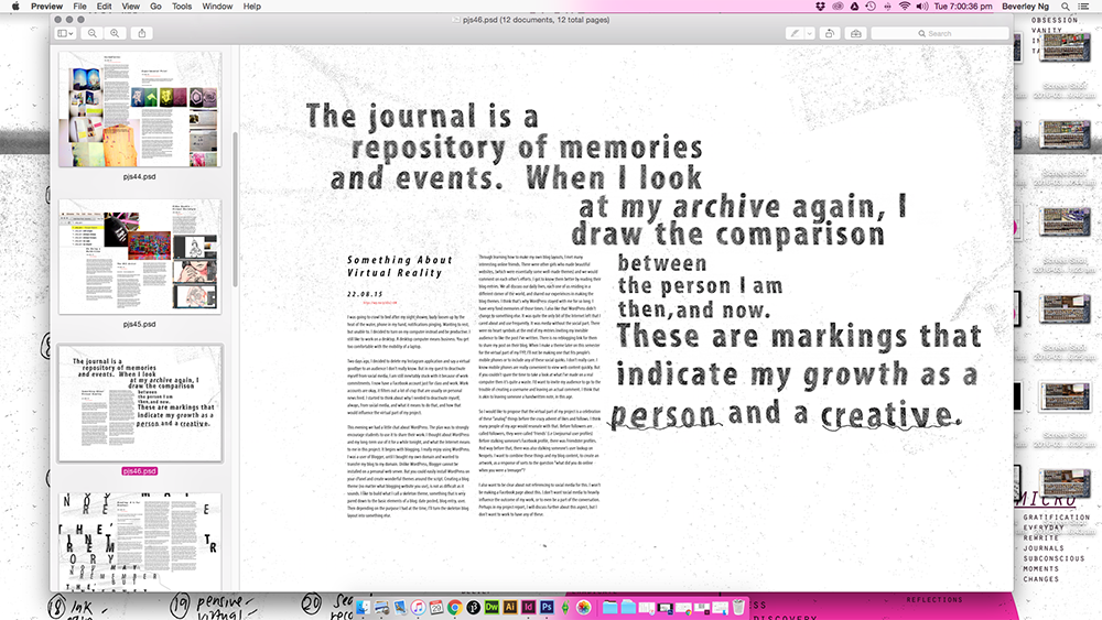
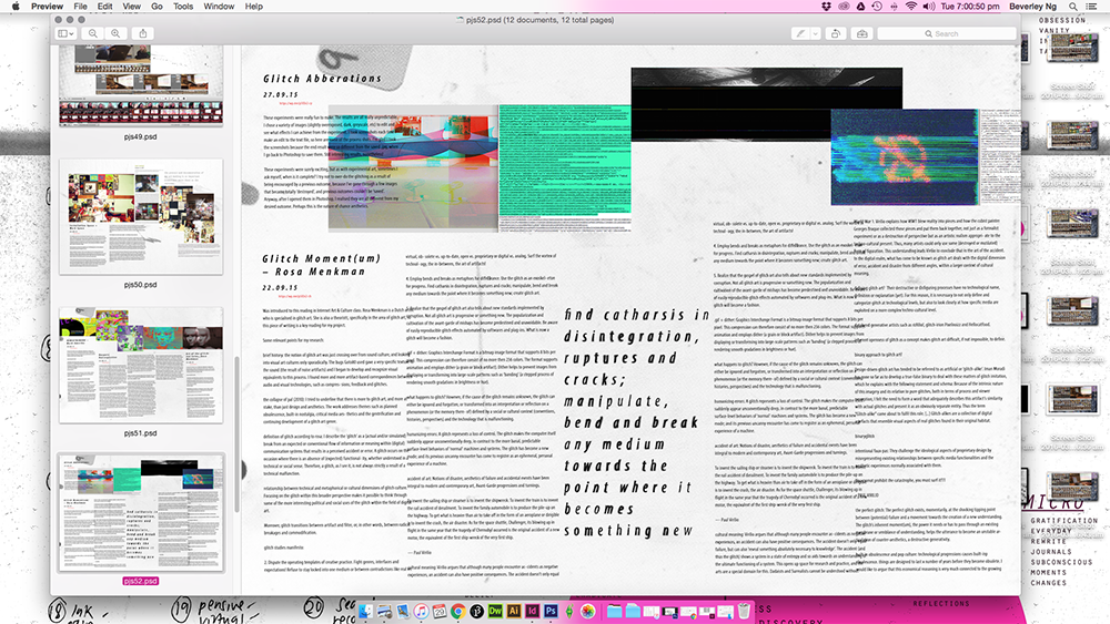
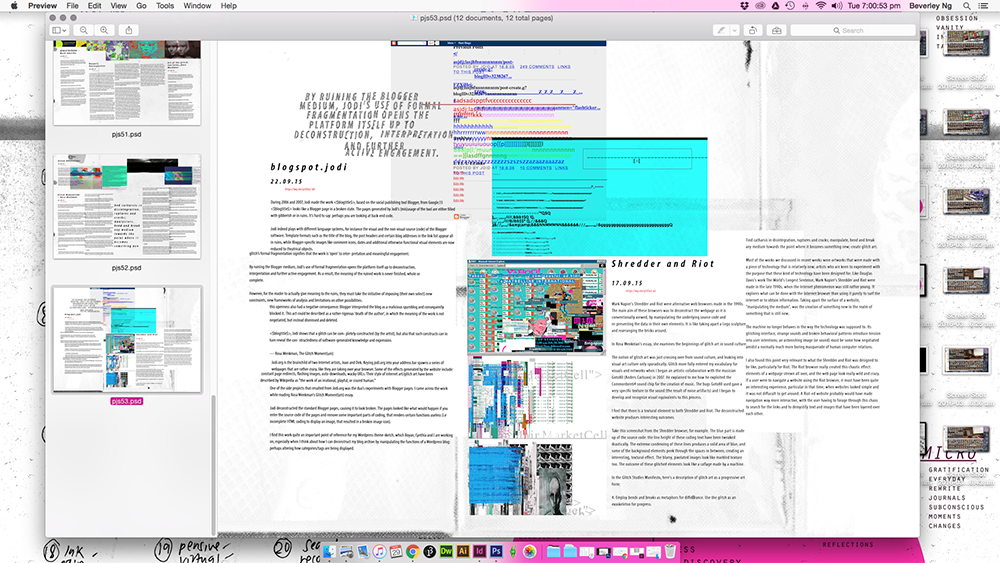
I’ve finished putting together my physical process books, and my challenge for the last two weeks was thinking about how to present my OSS and video documentations. Opened up InDesign and played around with some layouts. Truth be told, I don’t like InDesign. When I open it, the interface makes me feel like I ought to be putting things in neat, orderly fashion. Grids and columns stresses me out. I haven’t quite had the energy to try and make friends with InDesign yet. Perhaps not now. I left work on hold for the past week and sank into a pitiable state of self-pressure. No one is stressing me out or doubting me, but my own search for perfection is wearing me out. I went back to the comfort of Photoshop to make the spreads instead and I felt better than I had in weeks. I am reminded how enjoyable it was to make layouts in Photoshop with nobody to tell me how to put things in order. It was what this whole project is about: to go back, re-love, rediscover old methods of working, to find what made my art process work, and hold on to it.

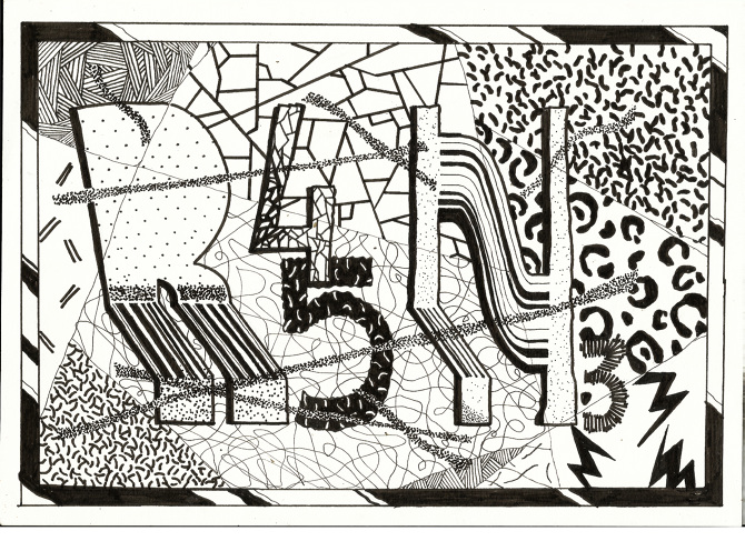
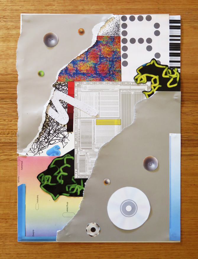
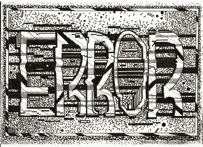
Anyway, making the process book was really fun. I always feel happy every time I hold the prototype in my hands.


moving img + layers

Lately I keep thinking about how the installation will come together. Working a bit on each aspect of my project, I realised that they shouldn’t exist as separate outcomes. I wanted to see how I could fuse both digital and print together. I also hope I can set up my work early so that I can work in situ. I really want to put things up as I go and rearrange them.

I played around with the projector in the VC lab and layered some animated collage against my process book.

Photo 14-3-16, 2 07 37 PM Photo 14-3-16, 2 07 40 PM

What I wanted to do was to make the animated collage a part of the giant map that I am doing and see how I can do away with viewing the ‘live data’ part of my work on the computer and incorporate with the big map and the blog archive.

moving collage 2

moving collage

Some gifs I made in attempt to capture the moving images against paper. I really love it, it makes the work come alive in such an exciting way. I want people to be able to immediately immerse themselves in this installation space of mine and my hybrid processes of making my work. Like I was saying in my previous post, I really wanted to see how I can go for a tactile approach to digital media. Which brings me to the next part of this post…

Photo 15-3-16, 9 51 14 PMPhoto 15-3-16, 9 51 20 PMPhoto 15-3-16, 9 51 23 PM

I made a prototype to show how I am putting together my big map, connecting all the concepts existing in my work. The elements of the map is set against my blog archive:

  • collages that I put together to reflect virtual nostalgia.
  • collages are connected using pink “branches” to the entries that are colour coded.
  • coloured entries are part of the database that I’ve been building and collecting on Google Sheets

Hopefully I am able to project the animated gifs on the wall space. Alternatively, I am considering installing iphones or ipads on the wall to display the animated work.

Lots of ideas going on this week… hope to share all on Friday.

tactile approaches to net art and aesthetics

One of the key things I want to explore through my visuals is to find the sweet spot between tactile art making and digital art. I’ve saved a collection of images to my Pinterest.

KEYWORDS

Throughout 2015, I was a little obsessed about finding a balance between making words and pictures. I feel that they have always been very separate processes. In the last few months, I think I’ve started to find a way to fuse them together. These are some of my thoughts and reasonings behind my visual output. I am paying close attention to how these areas are linked.

These are some works I found online by a Melbourne-based artist Rashee:

2_2_670 1_670 1_670-1 3_670-1 2_670 2_670-1 3_670 1_1_670

Rashee uses graffiti, painting and drawing to create artworks. His imagery is borrowed from system errors. What I like about his work that he takes a little inspiration from his borrowed imagery and let it expand into an abstract piece of shapes and beautiful mark-making. As a standalone piece, it is beautiful. It allows you to see the patterns that exist in these errors as marks made by the computer in an automatism fashion.

3D data visualisations

Printed my blog archive yesterday. After looking at the first batch of blog rolls for a full year, I finally came up with a solution to improve it. I really like the material of transparency and I want to use it throughout my body of work. It ties in perfectly with my concept of digital art making and being online.

Previously the typeset was in Courier New, and I changed it to Neue Haas Grotesk for a cleaner, sleeker look.

Photo 5b

Photo 5c

How it looks like, all rolled up. I’m still thinking about how I can install this. Perhaps glueing them to thin acrylic/metal rods and hanging it with fishing line from the top of the installation space. But I will worry about that in late April when everything else is mostly printed out and completed. I don’t want to stick too closely to any plans yet.

Photo 5dPhoto 5a  Photo 5f

My friend kindly loaned me his b&w laser printer. I really like how the text came out slightly pixelated, it does add a nice contrasting texture.

revised outcomes

tsklist mar

visual-mar4

Updated list of project outcomes:

  1. Physical data visualisations of blog archive
  2. Map of growing up in the age of Internet (Timeline), to be mounted on installation wall
  3. FYP report (formal)
  4. FYP report (publication accompanying the artwork)
  5. Process journal

I’m in the process of clearing things that have already been finished, like the 3d data vis and my process journal. Just rearranging them for print. Next week I will begin to make the map. Will share more on that. I’m alternating between report writing and making, as I feel that both will affect each other.

I have already printed out a part of my process journal and am quite satisfied with the outcome. I like the outcome a lot and even though I did this as a test print, I might just use it as the actual. I will bring it in for critique and feedback next Friday to see if there is anything else I can work on to make it better.

Images that are sourced online or are made on the computer are printed on transparency sticker. I kept the doodles and sketches from the notebook black. The paper I chose is called ‘sugar paper’ (what a cute name) from Art Friend. It feels really nice and suited for the nature of the ‘process journal’. It works beautifully to convey the handwritten nature of my text. I up the contrast and amount of black, and the laser print gives it that touch of shine on the paper which really looks like I’ve used my own pen to write in it. I decided to go for laser printing because my inkjet printer is simply unable to replicate that shiny black that I wanted.

In terms of material and paper choice, I wanted to highlight the dual nature of my process. I enjoy both doing work on paper and on computer. Transparency sticker and paper is used throughout the book, as it resembles the glossy nature of the computer screen, in contrast to the textured paper. I also feel that it makes the colour of the images pop, which would otherwise be slightly washed out if I had just printed it on the slightly greyish sugar paper.

Here’s a surprisingly high-res and accurate photo of the paper texture.

sugarpaper


Photo 4-3-16, 10 24 51 AM Photo 4-3-16, 10 25 03 AM Photo 4-3-16, 10 25 16 AM Photo 4-3-16, 10 25 22 AM Photo 4-3-16, 10 25 27 AM Photo 4-3-16, 10 25 35 AM

This is one of my favourite spreads.Photo 4-3-16, 10 25 52 AM Photo 4-3-16, 10 25 58 AM Photo 4-3-16, 10 26 07 AM